When the modern job search is incredibly competitive, how can you ensure your resume stands out among hundreds of applications? An infographic resume could be just what you need.
Here, we’ll explore when to use an infographic resume, what hiring managers have to say about these types of resumes — and how to make one for yourself.
Table of Contents
What is an infographic resume?
An infographic resume is a visual representation of your job experience, skills, and qualifications.
Instead of being text-based like a traditional resume, an infographic resume uses graphic design elements such as icons, graphs, and timelines to present your information.
When to Use an Infographic Resume
While infographic resumes certainly stand out among a sea of submissions, this type of resume isn’t appropriate for all job applications.
If you submit a resume in this format through an applicant tracking system, you could disqualify yourself if the technology can’t read visual information — so it’s best to stick to the format prescribed by the job posting.
Additionally, while an infographic resume might be a good idea for a more design-related role, it’s likely not a good idea for most non-design roles.
Infographic Resume Templates
If you’re interested in creating your own infographic resume, let’s take a look at some templates you can use to get started.
1. Simple infographic resume template.
This simple and minimal infographic resume template is from Venngage.
In this example, there’s plenty of white space. The resume also highlighted creative and software skills and left space for hobbies.
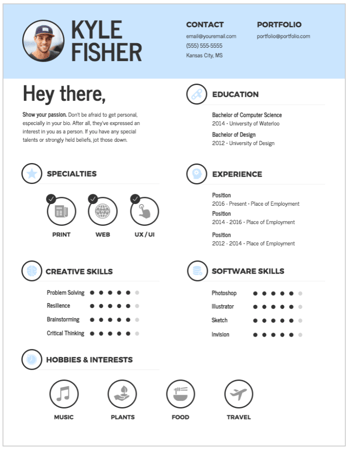
What we like: It’s clean and easy to follow. Each section is clearly defined and easy to scan. Plus, the round icons create a cohesive design element that brings the whole look together.
2. Graphic design infographic resume template.
This template is also from Venngage. This infographic template would be best for someone in a design role such as a graphic designer, or even a technical role.
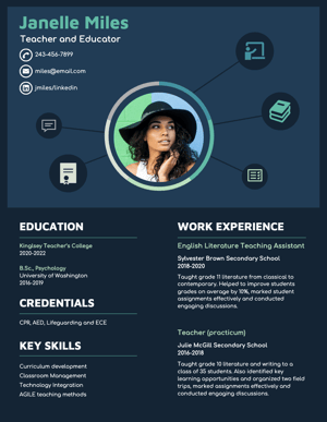
What we like: The design feature at the top of the resume immediately grabs the attention of the viewer and offers a visual overview of the applicant’s skills.
3. Marketing infographic resume template.
In this template from Venngage, you’ll see technical skills and educational training take up the majority of the space on the resume, signaling that this is the most important information.
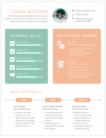
There’s also a timeline of work experience at the bottom, which is a creative way to showcase your career progression.
What we like: This template is best for a marketing role as it offers a balanced way to showcase both technical skills and creative elements.
How to Make an Infographic Resume
1. Start with a good structure.
Start by figuring out which tool you’re going to use to create your infographic. You might choose to create one in PowerPoint or use pre-made resume templates on a design website like Canva or Venngage.
Once you choose your tool, identify a good structure. Do you want your name and a brief opening description at the top? Would you prefer to put the education section at the beginning, or end? Are you going to include previous positions, or focus on just the current one?
Additionally, you might want to figure out whether you’re going to focus more on icons and images, or data.
“I love when candidates use infographics as an opportunity to highlight their creative or design abilities,” shares Devon Brown, Director of Global Executive Recruiting at HubSpot.
However, she urges candidates to ensure their design is clean and easily digestible.
“It has to be formatted in a way that makes it just as easy to read as a typical resume,” Brown advises. “The flow of information, and how it’s presented, is critically important if a candidate chooses to go this route.”
2. Take note of everything you want to include in your infographic resume.
Once you’ve chosen a structure, pull up an existing resume and take note of everything you want to transfer over to the infographic resume.
“I’ve had candidates share graphics on the types of roles they’ve supported, as well as metrics related to their current role,” says Kenny Nestle, HubSpot’s G&A recruiter.
For instance, if you want your infographic resume to be data-heavy, write down a few key metrics related to your current role, such as “43% YoY growth” or “12% increase in MRR.”
It’s easier to design your infographic resume once you know what you’ll need to include.
3. Choose a good color scheme.
A cohesive color scheme is a critical component of any good design, and this is no exception.
Consider using clean, complementary colors — like white, black, and orange, or yellow and teal — to help your resume stand out without becoming too distracting.
4. Have a strong opener.
This is a best practice for any resume, but particularly for an infographic, you’ll want to start with a good, powerful opener.
Tríona O’Sullivan, HubSpot’s former global marketing recruiter, shares how essential the opener is on any resume.
“Given how competitive and busy the job market is today,” O’Sullivan says, “it’s more important to ensure your resume is easy to review and states your experience and achievements clearly and quickly since that’s what someone is going to look for first when reviewing.”
Ultimately, your opener is your value proposition. What will you bring to the role that the hiring manager can’t find elsewhere?
5. Use good design principles.
If you want to create an infographic resume, it should use the same design principles as anything else you’d design.
These principles include:
- Creating balance using either symmetrical or asymmetrical designs.
- Leveraging contrast to highlight certain elements.
- Using movement to create a narrative and provide a high-quality user experience.
- Ensuring there’s unity in your design — i.e. your composition’s elements are in agreement.
Take a dive into design principles in this post to make sure your resume is top-notch.
But even if you’re making a design-forward resume, make the context a priority over everything else. Amelia Towle, HubSpot’s head of brand infrastructure and design team manager, spoke with her team on the potential merits of an infographic resume.
Keep your design simple.
“If I think about the purpose of a resume, it’s a document that your intended audience typically wants to scan as quickly as possible to glean information in an efficient way,” she says.
She continues, “If you drastically alter the format, you are perhaps forcing extra cognitive load on a busy recruiter who is just trying to narrow down a potentially vast pool of applicants.”
6. Make it actionable.
Even with additional design elements, there’s only so much information you can fit into an infographic resume.
To give recruiters another place to learn more about your work qualifications, make your resume actionable by including links to your portfolio, website, or LinkedIn.
“While I don’t love super creative infographic-style resumes, I love when someone hyperlinks to their portfolio or website, etc,” O’Sullivan adds. “That’s an amazing way to showcase both their experience and their thought process when it comes to applying for roles. If I see a hyperlink for one, 99% of the time, I will go and check that out.”
If you do choose to create an infographic resume, take a look at a few of these examples for inspiration.
Infographic Resume Examples
1. The colorful, graphic-heavy infographic resume.
The resume below uses plenty of visuals and numbers to highlight relevant information. For instance, there’s a graph to showcase the blog posts Caroline has written that have earned a spot on the first page of Google.
There’s a large “12” to highlight the years of content creation under her belt. There’s even an image of 10 stick figures to demonstrate her individuality.
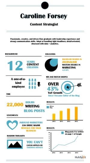
Consider how you might use one font, and a complementary color palette, to create a similar infographic.
Caroline designed this one using one of HubSpot’s free infographic templates, so feel free to create the same one using the templates, as well.
2. The data-heavy infographic resume.
In the following infographic resume (also created using HubSpot’s templates), you’ll see Caroline highlighted most of her accomplishments using data — such as the 45% YoY growth, 1,400 additional subscribers, or 24,000 hours managing deadlines.
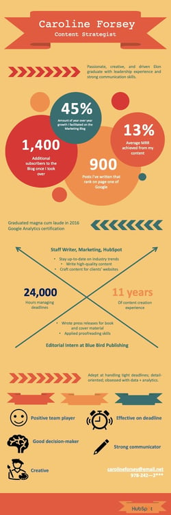
She also used icons of a smiley face, pencil, and painter to demonstrate some of her skills in a more visual form.
3. The minimal infographic resume.
The infographic resume below more closely resembles a traditional resume but includes a few graphic design elements that help it stand out.
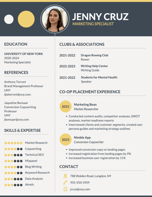
This example is best for someone who wants to showcase both technical and creative skills in a professional format.
We could see this infographic resume being used by someone in marketing or sales.
4. The traditional infographic resume.
This infographic resume more closely resembles a traditional resume but includes a few graphic design elements that help it stand out.
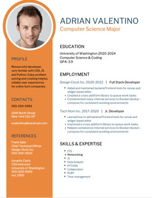
This example is best for someone who wants to make their resume stand out but doesn’t want to stray too far away from the traditional format.
5. The professional infographic resume.
This resume also leans towards a traditional format but incorporates more graphic design elements than the previous example.
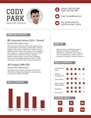
With several icons and even a bar graph at the bottom, this resume is more design-friendly than a standard resume but is still professional. It leaves plenty of room for text to expand on work experience and achievements.
This infographic resume could be used for a variety of roles, from something technical like a software engineer to a more visual position like a social media strategist.
Ready to take your resume to the next level? Grab some starter templates below.




![How to Optimize for Google’s Featured Snippets [Updated for 2024]](https://moz.com/images/blog/Blog-OG-images/How-to-Optimize-for-Googles-Featured-Snippets-OG-Image.png?w=1200&h=630&q=82&auto=format&fit=crop&dm=1724004002&s=13df73104762982790dab6dc8328023f)
