B2B products and services can be difficult to fully capture on a landing page—we know from experience. You’re often dealing with a longer sales cycle, multiple different decision-makers, and a complex offering that’s tricky to explain without info-dumping all over the page.
But great B2B landing pages do exist. And the most successful examples aren’t just pretty to look at—they also nail three super important principles. They…
- Create an engaging experience that makes prospects acutely aware of the problem you solve.
- Promote your offer clearly and simply.
- Cleverly lead visitors through consideration, towards conversion.
To help you better understand what goes into a high-converting B2B landing page, we’ve strapped on our marketing goggles and done a deep dive into some of the best examples we could find in 2023. Scroll through to see how these businesses are getting more leads with their pages, learn from their best marketing tactics, and find some inspiration for your next campaign.
Everything you need to know about B2B landing pages:
What is a B2B landing page?
Before we get into those sweet B2B landing page examples, let’s first talk a little bit about what a B2B landing page even is.
A B2B landing page is a standalone, campaign-specific web page created for a single marketing or advertising campaign. Think of it this way: It’s where a potential B2B customer “lands” after they click on a link from one of your ads, emails, or social media posts. Get it?
Sending your B2B traffic to a landing page is way more effective than sending folks to your website. That’s because landing pages are designed with just a single goal in mind: getting visitors to accept your call to action (or “CTA,” if you’re feelin’ cool). Your CTA is the goal of your whole campaign, whether it’s having your visitors fill out a contact form or schedule a product demo. A landing page is built to keep people entirely focused on your CTA, whereas websites give visitors the option to navigate around and get distracted by other stuff.
The result? Landing pages often get you more conversions than your website ever could.
Do landing pages work for B2B?
The short answer is “heck yes”—hence the 26 examples we’ve got comin’ for ya. That’s because B2B marketers face some unique challenges in getting new customers and growing their businesses:
B2B sales cycles can take forever. Unlike B2C and other business formats, convincing potential B2B customers to buy is a long game. Gimmicks and viral trends rarely move the needle. When it comes to introducing folks to (and educating ‘em on) your solution, B2B businesses need to be sure each touch point moves prospects closer to converting.
Lead generation is the name o’ the game. B2B businesses need to attract and convert qualified prospects to fill their sales funnels. (And believe us: that doesn’t come easy). One of the best ways for marketers to get these qualified leads is by exchanging valuable content (like an ebook or a whitepaper) for visitors’ contact information. You need to be able to build and launch lead gen landing pages fast, without a developer.
With all that in mind, landing pages—with their focus on that one singular call to action—are the best option for increasing the performance of your B2B marketing campaigns because they expedite the process of getting conversions.
B2B landing page best practices
Obviously, we all wanna create B2B landing pages that get more conversions. But what’s the gold standard? Here are some common attributes that all high-converting B2B landing pages have in common:
Strong hero image (and supporting imagery)
Context is everything. Visitors wanna know what your product or service looks like in practice, whether it’s a piece of fancy software or some sorta consulting program. Your landing page will be most impactful if you give some visual indication of how your offer works in your hero shot. (Bonus if you also make it easy for potential customers to visualize themselves enjoying the benefits.)
Focused call to action
The point of B2B landing pages is to get visitors to accept your call to action. Since your CTA is the main way you’ll be measuring your conversions, you gotta make sure it’s both easy to spot and compelling to read. The best move here is to remove secondary links that might distract your visitors or navigate them away from your B2B landing page before clickin’ on that CTA and converting. (That means site navigation, too).
Unique value proposition
What makes you different from the many other B2B businesses around that are offering the same service? Why should potential customers buy your product or service? That’s where your value proposition comes in. You can use the header and subheader on your B2B landing page to articulate exactly what sets your offer apart.
Tangible benefits (supported by features)
Talking about the benefits—the real, tangible value—of a product or service is the best way to persuade folks to act. People need to be able to imagine themselves enjoying the value your offer delivers. Of course, your audience also needs to know how your business provides that value (also known as the features), but they’re much more likely to convert if they understand the benefits they’ll get by clicking on that call to action button.
Social proof
The proof is in the pudding, as the saying goes. Think about it like word-of-mouth: we’re more likely to trust a product or service if we hear actual people talking about it positively. So go ahead, include social proof on your landing page. This could be testimonials, reviews, or partner logos. Social proof builds credibility with your audience and gets ‘em to convert faster.
The best B2B landing page examples in 2023
- ActiveCampaign
- Shopify
- B2B Quotes
- Monday
- MediaValet
- Thinkific
- Yelp
- Chargebee
- HubSpot
- Salesforce
- Impraise
- Reachdesk
- Outback Team Building & Training
- Zoho
- Divante
- Resource Guru
- TeamSupport
- Slack
- Intercom
- Blink
- GCC Facilities Management
- Salesflare
- Singular
- Vivonet Kiosk
- allWomen
- Raise Craze
- Unbounce
1. ActiveCampaign

Best practice to steal: Solve the problem your visitors care about most
When someone clicks through to your landing page, you usually have less than 15 seconds to capture their attention and show ‘em that they’re in the right place. This is especially true in the B2B world because decision-makers are trying to solve a specific business problem.
Take this example from ActiveCampaign. They aren’t just targeting visitors who are searching for any old email marketing platform. They’re targeting visitors who care deeply about personalization and segmentation. If this is you, then you’ll breathe a sigh of relief when you read the headline of the page: “Put the right emails in front of the right people.”
Notice how the focus of the headline isn’t on the platform or any specific features that ActiveCampaign has to offer. It’s focused on the visitor and the goal they’re trying to accomplish. That’s customer-centric marketing in action, and hot damn—it’s a beautiful thing to see.
2. Shopify

Best practice to steal: Make the first step as easy as possible
When qualifying B2B leads, it can be tempting to ask them every possible question your sales team could possibly want to know about. “What’s your name? What’s your phone number? How big is your company? How old were you when you stopped wetting the bed?” It’s enough to make anyone want to click away. (And not just because I wet the bed until the third grade.)
This example from Shopify proves that sometimes less is more. Rather than scare people away with a big ol’ form of questions on the landing page, they make it as easy as pie to get started with a free trial. All you gotta do is enter your email address and—woah, that’s it.
If cutting down on your form fields makes you nervous, keep in mind that there will still be time to collect more info from your leads later in the sales process. This landing page just helps to get their foot in the door.
3. B2B Quotes

Best practice to steal: Get as specific as possible with your CTA
So many B2B landing pages have the exact same CTA buttons. “Get Started,” “Start Your Free Trial,” and “Request a Consultation” are some of the most popular ones that I’ve come across. And while these can work well sometimes—they’re not always the best option.
This example from B2B Quotes shows how you can get more specific with your CTA to persuade more people to convert. The form at the top asks visitors to fill out some personal info about what they’re looking for, and then ends with a button that says… drumroll… “Get 3 Quotes Now.”
It’s so simple and yet so powerful—by being specific about the number of quotes, the page sets expectations nicely. If the form simply said “Submit” (another super common CTA on B2B landing pages) then visitors would have no idea what they would get when they clicked that button. And if visitors don’t know what they’re getting next, then they have less reason to follow-through.
4. Monday
Best practice to steal: Leverage trust from complimentary B2B services
Monday.com is certainly no bum when it comes to their branding and storytelling. (We’ve all happily sat through a full Youtube ad from them at some point.) But what’s more impressive is their landing page strategy.
On this page, instead of focusing on their own product and its wonderful benefits and features, Monday also invokes Slack: both as a recognizable brand to establish a sense of trust, as well as to showcase how seamlessly their service works with another popular tool.
Monday still talks about their main value props, like project execution and collaborative workspaces, but they double their chances of conversions by wrapping their figurative arms around another brand.
5. MediaValet

Best practice to steal: Use the rule of three for layouts and benefit copy
The rule of three is one of the most successful methods for memorizing content—we’ve seen it used in film, advertising, and beyond—and MediaValet’s landing page is no exception.
The digital asset management company applies the rule of three when presenting their key benefits and testimonials. This clear, concise, and easy-to-consume structure is also key to the landing page’s successful layout: it introduces the product, backs up their claims with stats, and provides an easy way for prospects to request a demo. The easier visitors can consume and retain the content on your landing page, the better equipped they are to make a decision to purchase.
6. Thinkific

Best practice to steal: Show visitors what results they can expect
This is an all-around beautiful landing page from Thinkific, but we want to draw your attention to one element in particular. About halfway through the page, they’ve included an interactive tool with the title: “This is how much you could earn on Thinkific.”

This tool on the page includes two fields that you can adjust: how much you plan to charge per online course, and how many students you estimate you’ll have. It’s a really clever way to help visitors visualize their future success with the platform (“Wait, we could be making HOW MUCH?!”), and makes signing up for a 30-day trial seem like a no-brainer decision.
You can design beautiful landing pages like Thinkific using the Unbounce drag-and-drop builder. Get started with your free 14-day trial today.
7. Yelp
Best practice to steal: Don’t beat around the bush
Yelp wants you to know that you can list your business on it for free—and it wastes no time illustrating that point. Not only that, their call to action takes you directly to list your business. There are no other hoops to jump through, like downloading an app or grabbing an email. Click the button, and boom—you’re Yelpin’.
Yelp is short and direct with their messaging, speaking to exactly what you’ll get by listing on their platforms. In just a few lines of copy, they communicate exactly what you get by signing up—and why you’d want to. Impressive stuff!
8. HubSpot

Best practice to steal: Try segmenting your leads with landing pages
How do you tell visitors about your B2B tool if you don’t know who they are or why they want it in the first place? Many SaaS platforms face this challenge because they have multiple different target audiences and use cases—which means it’d take up a lot of space on the page to explain every single important point for every single person.
That’s why this example from HubSpot caught our attention. Rather than go into great detail about how all of the different segments can use their software, HubSpot created one short landing page to direct each segment into their own personalized demo. It’s kinda bare-bones, but it gets the job done.
9. Salesforce

Best practice to steal: Let the numbers do the talking
Like the previous example, this no-nonsense page from Salesforce shows you that looks aren’t everything. Because even when you strip away all the fancy design elements and photographs, you’re still left with a compelling case for why you should try their CRM platform.
The secret is in the social proof numbers that they bold on the page. “Discover how Canadian customers have achieved: +37% increase in sales, +45% increase in customer satisfaction, and +43% increase in marketing ROI.” These are exactly the types of results that visitors are looking for when they end up on this page. And of course, the most important number is right at the top: “Grow Your Business with the World’s #1 Business CRM.”
Data can be powerfully persuasive—especially in B2B where customers need to see those hard numbers to ensure they’re making the right decision.
10. Chargebee
Best practice to steal: Don’t hesitate to go after your competitors
Chargebee knows that Recurly, a subscription and billing platform, is one of their top competitors. On this landing page, they go for the kill with a testimonial implying it could take “months” to enter a new market with Recurly, where with Chargebee, it’s only a matter of days.
The fact that this comes from a testimonial and has that social proof backing it up makes it all the more strong. They also use “subscription management software” in their headline, which is how their competitor self-describes. Gotta hand it to ’em.
This is also a great example of a pay-per-click (or PPC) landing page, meaning advertisers bid on specific keywords and pay a fee whenever their ad is clicked. In this case, Chargebee is paying to appear in Google searches for “recurly” and other branded keywords. They know who they’re up against, and they’re not afraid to duke it out publicly.
11. Impraise

Best practice to steal: Use landing pages to capture top-of-funnel leads, too
When you think about B2B landing pages, you often think about the bottom of the funnel. Demo requests, consultation calls, free trial sign-ups—marketers often use their PPC budget and landing pages to drive visitors directly towards these goals. But if these folks aren’t ready to make a purchase decision yet, sending them to a page like this can be putting them in an awkward position. It’s a bit like asking the cute barista who smiled at you once (but still spells your name wrong on the coffee cup) if she wants to elope with you to Vegas next week.
That’s where the top of the funnel comes into play. Ebooks, webinars, and other free resources can be great for attracting visitors to your brand and collecting their contact info. From there, you can build a real relationship with each new lead until the point when they’re ready to make a commitment.
Take this example from Impraise. They used Unbounce to create a lead capture page targeting HR professionals. There aren’t any distractions on the page, the focus is squarely on the free resource: “The Guide to People Enablement Programs.” Visitors have the option to download the guide directly on this page in exchange for their email address, or—if they’re already searching for performance management software—go ahead and explore the Impraise platform.
12. Outback Team Building & Training
Best practice to steal: Use Dynamic Text Replacement (DTR) to personalize your landing pages
Marketers sometimes think that personalization doesn’t matter as much when it comes to B2B. But it’s almost always a good idea to get as specific as possible with your landing page so the decision-maker you’re targeting thinks, “Aha, this is for me!”
That’s where Dynamic Text Replacement (DTR) and this Unbounce-built example from Outback Team Building & Training shines. The original headline here reads: “Trusted Source for Scavenger Hunt Team Building Activities in Your City.” But by using DTR and Google Ads Keyword Insertion, the marketers over at Outback were able to replace the last bit of that headline (“Your City”) with actual city names (e.g., “San Francisco” or “Toronto”).
Using this tactic, they were able to target this one single landing page for people all across North America and give them a personalized experience at the same time. Now that’s efficiency.
13. Reachdesk
Best practice to steal: Put your high-value content front-and-center
We like to stay impartial, but Reachdesk is pretty darn cool. They’re all about data-driven gifting to create deeper connections in marketing, plus they’re committed to creating a future of gifting with zero waste. But what makes us even bigger fans is how simply yet effectively they’re demonstrating one of the golden rules of high-converting B2B landing pages: creating high-value content so engaging and well-targeted that it makes your audience wanna click your CTA ASAP.
Even though the guide is all about direct mail (something you wouldn’t guess today’s marketers are thinking much about), Reachdesk draws in the right crowd by talking about the comeback of event marketing and how gifting can make ‘em more impactful. We’re more than intrigued.
14. Zoho

Best practice to steal: Use landing pages to target your competitors
When evaluating B2B tools, business leaders rarely make a purchase based on the first landing page they see. This is a business investment, so most folks want to do their due diligence and research all possible options before making a final decision.
That’s why—for better or worse—competitor landing pages have become a thing. The idea is that you can bid on a competitor keyword or brand name using Google Ads, and create a landing page that directly compares your product or service to the one visitors are actually searching for.
This page from Zoho comes up when you search for “Mailchimp alternatives,” for example. While you can’t use competitor names in your ads (that can get you in big legal trouble), you can use them at the top of your landing page to help make the page more relevant (and bring your quality score up). It’s an interesting approach that has many companies even bidding on their own brand names to stave off the competition.
15. Divante

Best practice to steal: Where appropriate, bring prospects through several stages of the customer journey
Sales cycles vary per industry, sure, but the process always starts with building interest and (ideally) ends with a purchase decision. And here’s the great thing about landing pages—designed properly, you can take readers through each of these stages as they scroll from top to bottom, without them ever having to leave the page.
This long-form landing page from Divante builds awareness by offering a description of their service (in the first two page sections), they guide prospects through consideration with a list of features and benefits, and then drive conversions by detailing available plans alongside their calls to action (i.e. “Choose plan” or “Ask for pricing,” respectively).
Of course, some visitors will also know exactly what they’re looking for from the start, so Divante includes anchor navigation on this page as well for a choose-your-adventure experience. Thanks to this, more qualified prospects can jump straight to the details that’re most relevant to them (making a longer page like this much more digestible).
16. Resource Guru

Best practice to steal: Help prospects visualize a complex idea with video.
Many B2B products and services solve complex problems. As a result, landing pages need to be designed in such a way that they make it easy for potential customers to understand features and benefits. One way to do this is to incorporate visual elements like videos, images, and even animations—all of which can help drive conversions.
Resource Guru’s landing page is effective because it greets viewers with a large play button as soon as they land. Pressing play is intuitive and launches a high-quality explainer video. They let this video do the talking, then quickly request an action from visitors.
One thing to keep in mind—it’s always a good idea to reiterate all the core points from your video script on your landing page in text. This ensures that even in the event you have a low play rate, prospects can still learn about your offer without having to click play. Whether they left their headphones at home that day or prefer text, it’s good to have a backup plan.
17. TeamSupport
Best practice to steal: Keep it stupidly simple
TeamSupport is a complete product suite of customer support software that empowers their clients to be more customer-centric. Their tagline speaks for itself: “B2B customer support made simple.” And you don’t have to go far to catch their drift: On this landing page, they keep it simple, too. TeamSupport shows you that they put their money where their mouth is by giving you the immediate option of scheduling a live demo with an expert. And they give you some of the key value propositions along with it.
Sometimes simplicity really wins it all.
18. Slack

Best practice to steal: Try out new positioning on your landing pages
Most people think of Slack as a workplace chat platform, right? Well, this example shows how you can use your landing page to literally change the way people think about your product or service.
In the hero section, you can see their new positioning in action. Slack isn’t for chatting with your colleagues and sending them zesty memes from the first 10 seasons of The Simpsons. (OK, that’s not all it’s for, anyway.) According to the hero section of this landing page, “Slack is where work happens.”
The page goes on to describe the Slack platform as a “collaboration hub” where you can “create a channel for every conversation” and “find what you need quickly.” In just a few minutes, the page changes your opinion of Slack and makes a compelling case for why your business needs it. Couple that with the strong social proof and case studies, and you’ve successfully positioned yourself differently in the minds of your visitors.
19. Intercom

Best practice to steal: You might have to link out to other pages if visitors need more info
Typically, linking from your B2B landing page to multiple different pages of your website would be a no-no. You want to keep visitors focused on a singular CTA so they are more likely to convert. But in B2B, sometimes folks need more details before they can pull the trigger and decide to buy.
Take this example from Intercom. The main CTA is to start your free trial, but the page also gives visitors the option to learn more about how they can use the platform to acquire, engage, and support customers. Each of these buttons takes you to a different section of their website, with more details on those use cases. It’s not one of our landing page best practices—but sometimes you’ve gotta break those rules to give visitors what they need in the moment.
This way, the page itself works as an offer for people who are interested in getting started right away, and as a route for more problem-aware visitors to explore.
20. Blink

Best practice to steal: Include the right kind of proof to build trust and credibility.
Social proof and testimonials in your B2B landing pages are always important. But while a snazzy headshot photo and a great quote from one of your customers can work in some cases, there are also other ways you can (and should) build trust on your landing page.
This example from Blink shows three different types of social proof you can pack in to persuade visitors. First, they hit you with the logos of some of their “Select Clients,” which include heavy-hitters like Google, Starbucks, Amazon, and NASA. (Damn. That’s an impressive logo bar.) Then, the page shows you some testimonials from their satisfied clients. Finally, they show off some of the industry awards Blink has won over the years to seal the deal.
Including one or two testimonials can be helpful, sure. But when you include this much social proof on a B2B landing page it creates a bandwagon effect that’s hard to resist.
21. GCC Facilities Management

Best practice to steal: Use iconography to make your page easier to follow
It’s so easy to overload your B2B landing page with way too much text that 90% of visitors will never actually read. I know from experience—there’s usually a lot you want to explain about your product or service, and it’s not always easy to do that in 140 characters or less.
This Unbounce-built landing page for GCC Facilities Management (designed by the agency Session Media) shows how clear iconography can help get ideas across in a more visual way—even if visitors don’t read all your copy. Every point on the page is punctuated with an illustrated icon for people who are quickly skimming. They smartly use the same brand colors throughout to give the whole page a nice cohesive look as well (although We’re not sure who has a toilet lid that’s the same color as their carpets). Still, that’s a win for this B2B landing page design.
Want to make sure your page doesn’t rely too heavily on text? Try performing a squint test and see if you can still tell what the page is about without reading any of the copy.
22. Salesflare

Best practice to steal: Answer the big questions your visitors might be asking themselves
Here’s an interesting example from Salesflare that doubles as both a lead magnet and a free trial sign-up page. The page starts with an offer to download a “Free Sales Funnel Template.” But for people who aren’t familiar with sales funnels (like me), they highlight and answer all the potential questions you might have. (“What is this? Why do I need it? And what the heck is a sales funnel, anyway?”)
This B2B landing page goes on to explain that when you’re tired of using free Excel templates (like that one you just downloaded), you can start your free trial of Salesflare. Using the same question-answer approach, the page then covers the benefits of the software and why you should be using it.
The lesson for B2B marketers? Try to get inside the heads of your visitors and answer any questions they have before they even think to ask ‘em.
23. Singular

Best practice to steal: Provide different CTAs for visitors at different stages of their buyer journey
As I mentioned earlier, it may go against one of our landing page best practices, but having multiple CTAs on your page can sometimes be a smart choice. If you’re targeting a broad audience, then visitors who click on your page may be in different stages of awareness (and looking to take different next steps in their buyer journey). Sure, Person A might be ready to start their free trial. But Person B might just want to try a demo. And don’t even get me started on Person C (that guy sucks).
That’s exactly why this example from Singular features a main CTA to enter your email address and “Create Your Free Account”—but it also includes a secondary CTA for visitors who aren’t ready to sign up yet to “Talk to an Expert.” Giving that bit of choice to visitors helps them cast a wider net with their targeting.
24. Vivonet Kiosk
Best practice to steal: A floating CTA can give you a greater chance to convert.
A B2B landing page has one goal—to convince visitors to take action. Whatever the intended next step, it’s your job to create a clear, strategically placed call to action that lets visitors know what to do next. Using multiple CTAs can be distracting to your audience, but a consistent CTA that follows visitors throughout their experience? That’s crystal clear.
Vivonet Kiosk uses a floating CTA button that follows visitors as they scroll down the page. No matter where they’re at, the “Talk to Us About Kiosks” button remains in the bottom right-hand corner of their screen.
25. allWomen

Best practice to steal: Keep it focused and to the point
What B2B landing pages allow you to do—that your website just can’t—is to be laser-focused on one of your products or offerings. What allWomen—an academy that upskills women in the workforce to take on and excel in tech positions—does great with their landing pages is to present information about each of their courses super clearly. Just look at that headline—as soon as you land here you know exactly what’s being offered and if the content that follows is relevant to you.
Want to learn more about allWomen’s landing page strategy? Here’s their story.
26. Raise Craze

Best practice to steal: Know what sets you apart
As a small SaaS company with loads of competitors, Raise Craze can’t waste a single click. And to do just that they make sure to let their audience know what exactly makes them different—whether through their value proposition stamped into their headline, multiple uses of social proof, or even a clever section called “why choose Raise Craze?” that spells it out. It’s landing page 101 to lean into your unique selling proposition to stand out from the crowd.
Wanna hear more about Raise Craze? Dive into their landing page journey.
27. Unbounce
Best practice to steal: Test multiple variants of your landing page
The beautiful thing about landing pages is that you can actually test and see what works best for your audience. That’s what we’re doing here at Unbounce with this landing page for our guide: How to Optimize Your SaaS Landing Pages. Our team wanted to test two variants of this top-of-funnel page—the one above, and this one below that emphasizes the experience of CRO expert Talia Wolf (who helped co-author the guide).

Rather than run a traditional A/B Test, our team decided to use Smart Traffic to get results faster. With Smart Traffic, you can use AI to match each visitor to the variant that’s most likely to convert. (Woah, it’s like we’re living in the not-so-distant future.) After turning this feature on, we ended up seeing conversion lifts across both variants. Domo arigato, Mr. Roboto!
Start Building the Next Great B2B Landing Page
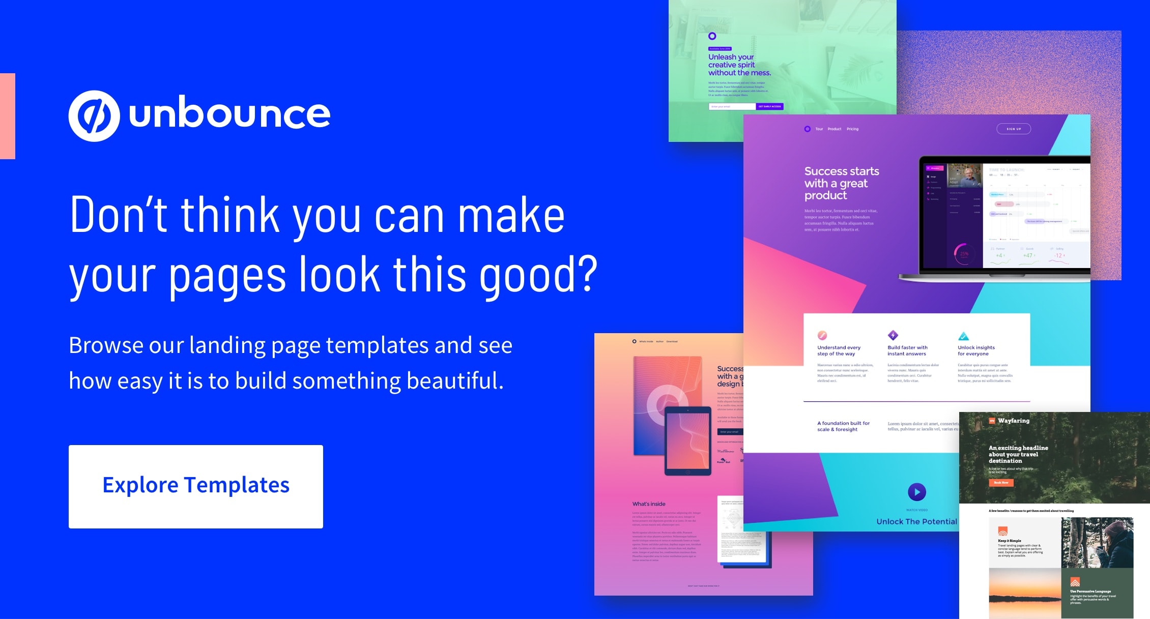
Feeling inspired? A lot of these examples were built using the Unbounce drag-and-drop landing page builder. Get started today with your free 14-day trial, or keep digging for inspiration by exploring over 100+ high-converting templates.


![How to Optimize for Google’s Featured Snippets [Updated for 2024]](https://moz.com/images/blog/Blog-OG-images/How-to-Optimize-for-Googles-Featured-Snippets-OG-Image.png?w=1200&h=630&q=82&auto=format&fit=crop&dm=1724004002&s=13df73104762982790dab6dc8328023f)
