Cumulative Layout Shift (CLS) measures the visual stability of a page as it loads. It does this by looking at how big elements are and how far they move. It’s one of the three Core Web Vitals metrics Google uses to measure page experience.
CLS is calculated during the five-second window where the most shifting occurs.
Sidenote.
Expected layout shifts, like after a user action, are fine and expected. Shifts within 500 ms of a user interaction are excluded from the calculations.
Here’s how it’s measured:
layout shift score = impact fraction x distance fraction
Or said in a more understandable way, it’s:
layout shift score = % of the viewport that changed * the distance an unstable element moved
The reason CLS is important is it’s annoying when you try to click something on a page that shifts and then end up clicking on something you don’t intend to.
It happens to me all the time. I click on one thing and, suddenly, I’m clicking on an ad and am now not even on the same website. As a user, I find that frustrating.
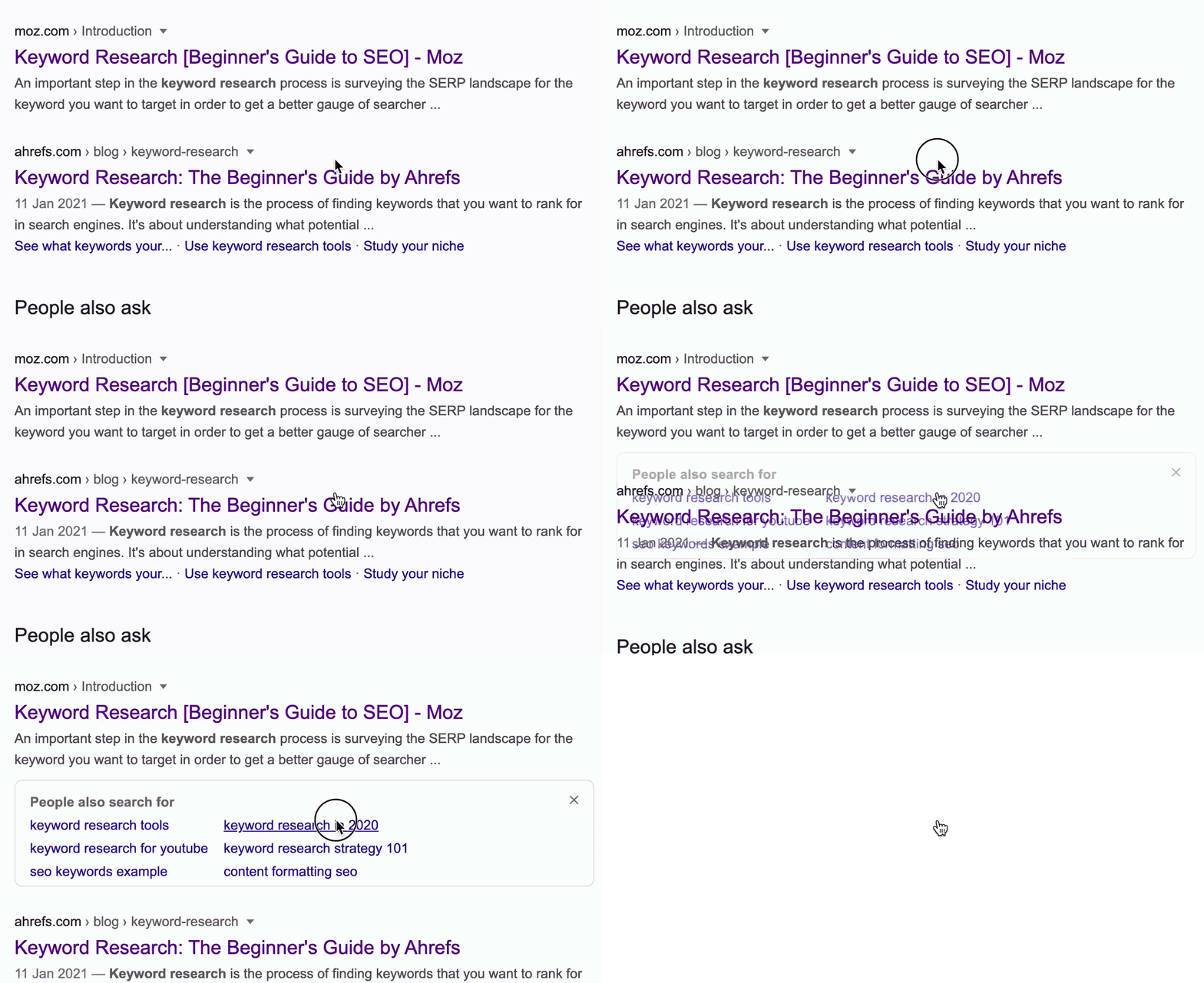
Common causes of CLS include:
- Images without dimensions.
- Ads, embeds, and iframes without dimensions.
- Injecting content with JavaScript.
- Applying fonts or styles late in the load.
Let’s look at what your CLS score should be and how to improve it.
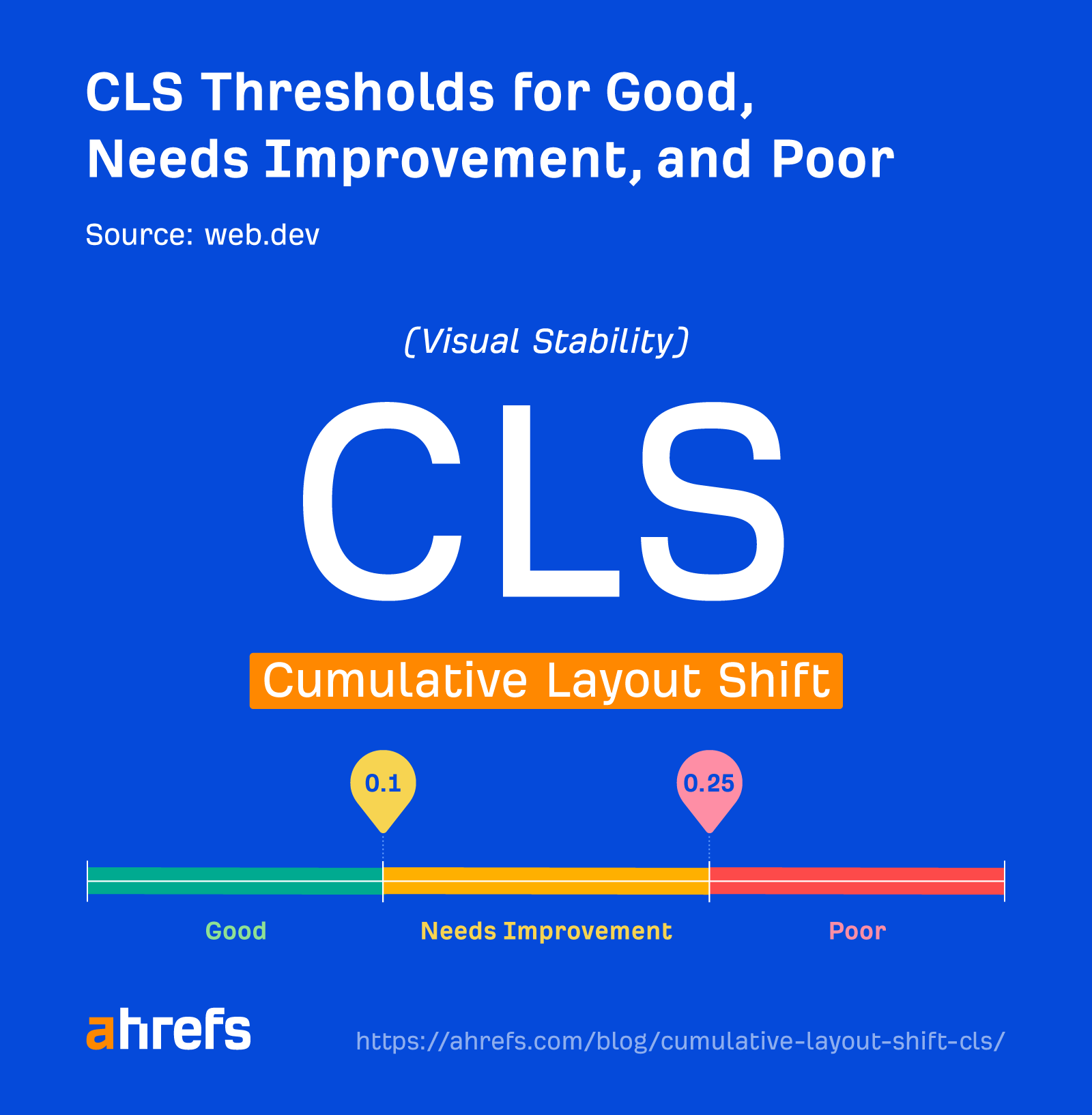
A good CLS score is less than or equal to 0.1 and should be based on Chrome User Experience Report (CrUX) data. This is data from actual users of Chrome who are on your site and have opted in to sharing this information. You need 75% of page loads to have a CLS score of 0.1 or lower.
Your page may be classified into one of the following buckets:
- Good: <=0.1
- Needs improvement: >0.1 and <=0.25
- Poor: >0.25
CLS data
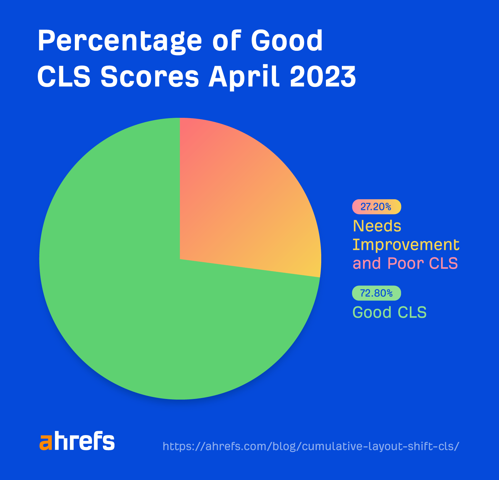
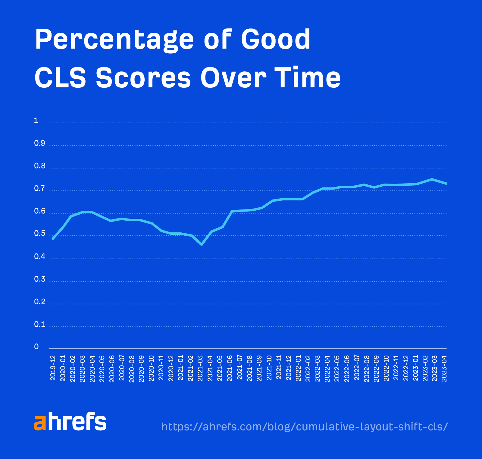
72.8% of sites have good CLS scores as of April 2023. This is averaged across the site. As we mentioned, you need 75% of page loads to have a CLS score of 0.1 or lower to be classified as good.
CLS is the most improved Core Web Vital since Google’s push for faster websites.
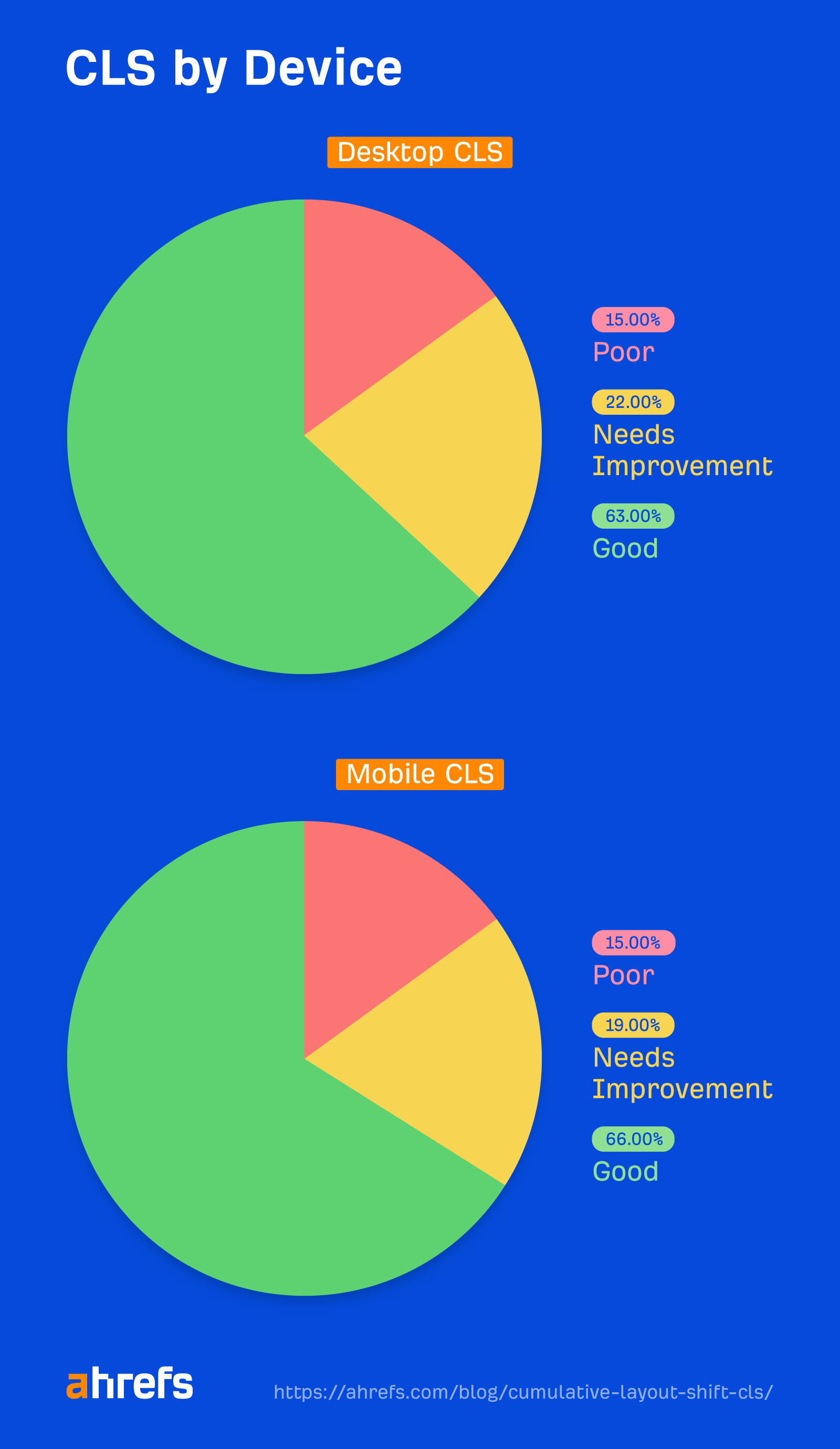
When we ran a study at the page level using Site Audit data, we saw that CLS is similar on desktop and mobile.
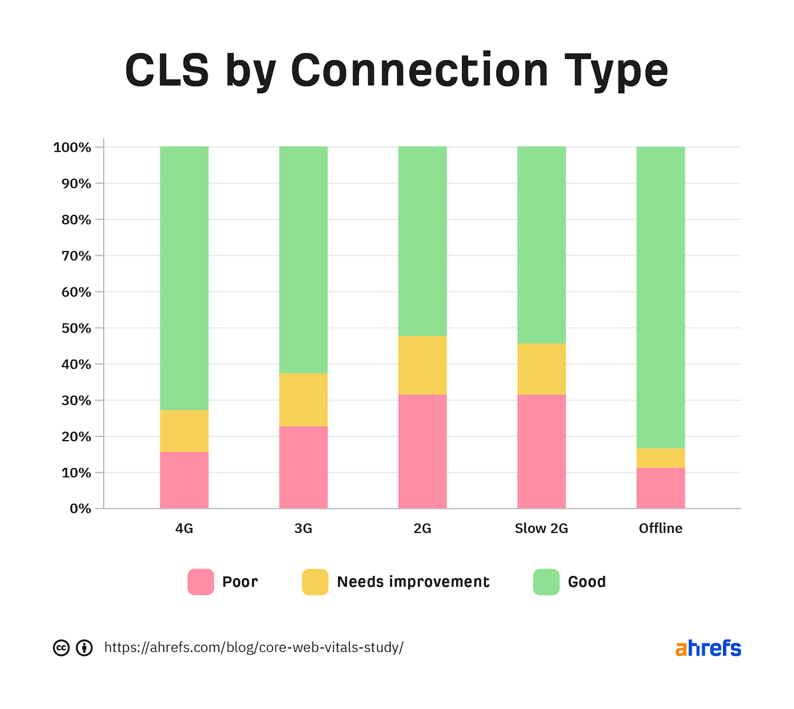
We also noted many sites struggle with CLS, especially on slower connections.
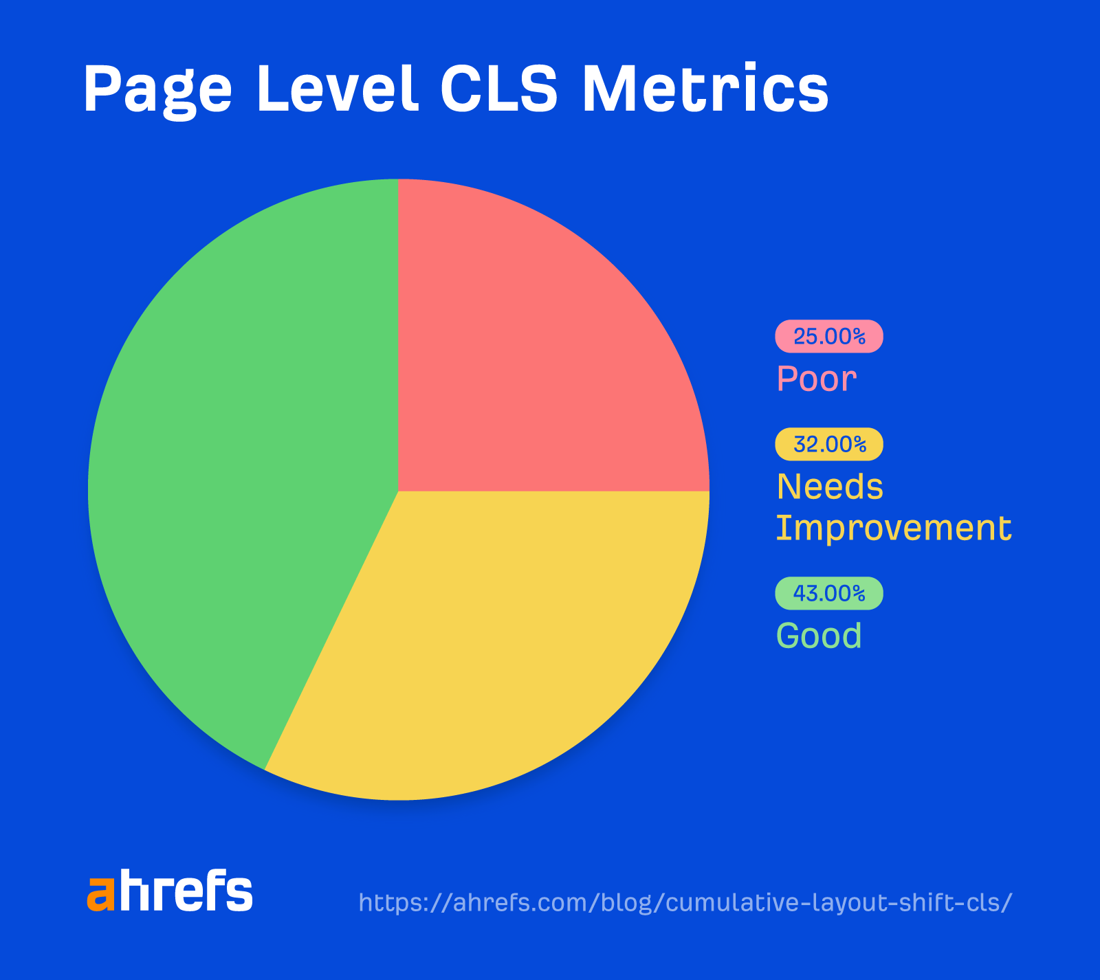
CLS is worse in the page-level data than the origin data. It’s likely that people are improving their main pages, which get more traffic, while leaving a lot of other pages with failing scores.
There are different ways of measuring CLS: field data and lab data.
Field data comes from the Chrome User Experience Report (CrUX), which is data from real users of Chrome who choose to share their data. This gives you the best idea of real-world CLS performance. It’s also what you’ll actually be measured on by Google for Core Web Vitals.
Lab data is based on tests with the same conditions to make tests repeatable. Google doesn’t use this for Core Web Vitals. But it’s useful for testing because CrUX/field data is a 28-day rolling average, so it takes a while to see the impact of changes.
The best tool to measure CLS depends on the type of data you want (lab/field) and whether you want it for one URL or many.
Measuring CLS for a single URL
Pagespeed Insights pulls page-level field data that you can’t otherwise query in the CrUX dataset. It also runs lab tests for you based on Google Lighthouse and gives you origin data so you can compare page performance to the entire site.
Measuring CLS for many URLs or an entire site
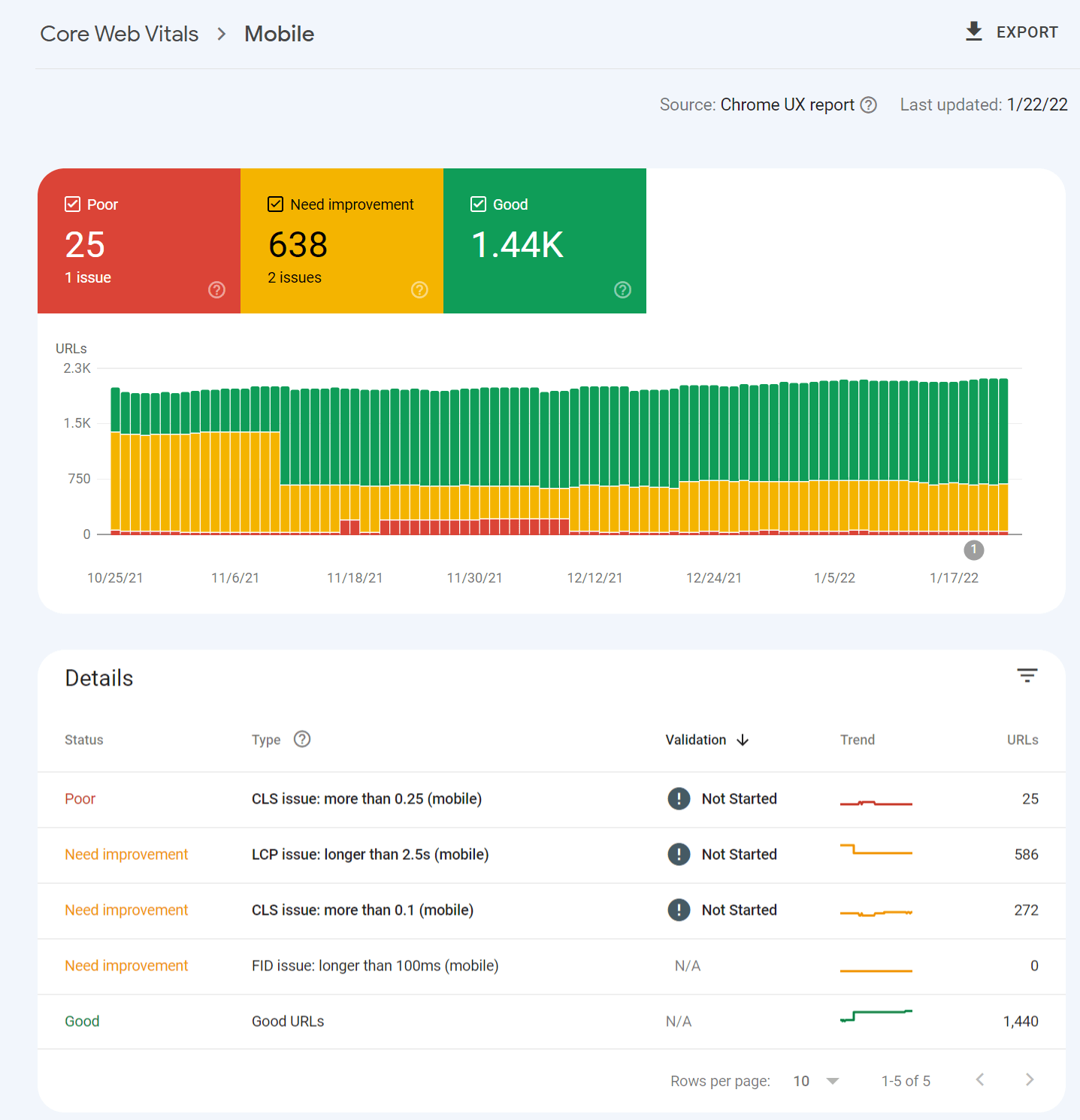
You can get CrUX data in Google Search Console that is bucketed into the categories of good, needs improvement, and poor.
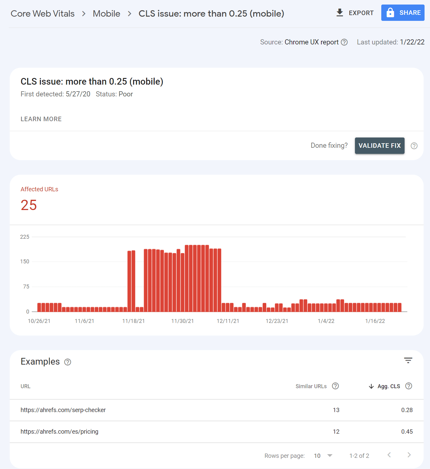
Clicking into one of the issues gives you a breakdown of page groups that are impacted. The groups are pages with similar values that likely use the same template. You make the changes once in the template, and that will be fixed across the pages in the group.
If you want both lab data and field data at scale, the only way to get that is through the PageSpeed Insights API. You can connect to it easily with Ahrefs’ Site Audit and get reports detailing your performance. This is free for verified sites with an Ahrefs Webmaster Tools (AWT) account.
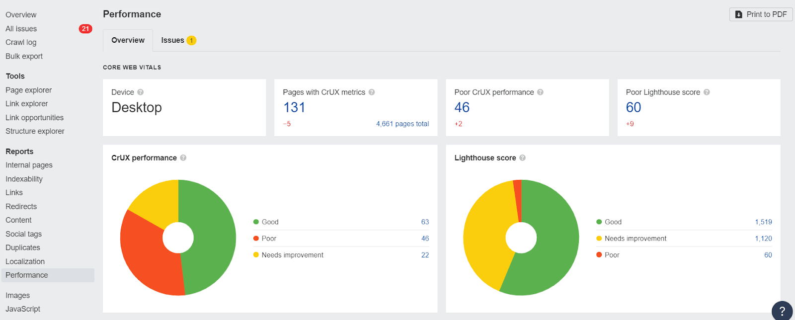
Note that the Core Web Vitals data shown will be determined by the user-agent you select for your crawl during the setup. If you crawl from mobile, you’ll get mobile CWV values from the API.
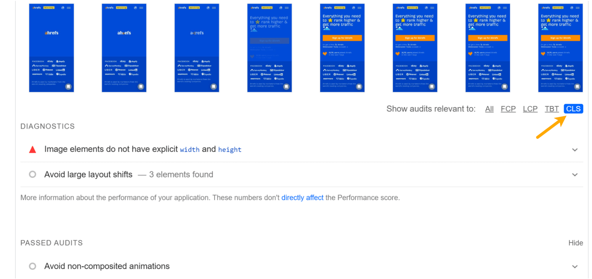
In PageSpeed Insights, if you select CLS in the “Diagnostics” section, you can see all the related issues like “Avoid large layout shifts.” These are the issues you’ll want to solve.
In most cases, to optimize CLS, you’re going to be working on issues related to images, fonts or, possibly, injected content. Let’s look at each case.
1. Reserve space for images, videos, iframes
For images, what you need to do is reserve the space so that there’s no shift and the image simply fills that space. This can mean setting the height and width of images by specifying them within the <img> tag like this:
<img src=“cat.jpg" width="640" height="360" alt=“cat with string" />
For responsive images, you need to use a srcset like this:
<img
width="1000"
height="1000"
src="https://ahrefs.com/blog/cumulative-layout-shift-cls/puppy-1000.jpg"
srcset="https://ahrefs.com/puppy-1000.jpg 1000w, https://ahrefs.com/puppy-2000.jpg 2000w, https://ahrefs.com/puppy-3000.jpg 3000w"
alt="Puppy with balloons" />
You’ll also want to reserve the space needed for things like videos and iframes. For dynamic content like ads, you will want to reserve the max space needed.
There’s also a relatively new CSS property called aspect-ratio that will allow you to set a dynamic width based on the screen size, and the browser will calculate the appropriate height for you.
2. Optimize fonts
For fonts, the goal is to get the font on the screen as fast as possible and to not swap it with another font. When a font is loaded or changed, you end up with a noticeable shift like a Flash of Invisible Text (FOIT) or Flash of Unstyled Text (FOUT).
If you can use a system font, do that. There’s nothing to load, so there are no delays or changes that will cause a shift.
If you have to use a custom font, the current best method for minimizing CLS is to combine <link rel=”preload”> (which is going to try to grab your font as soon as possible) and font-display: optional (which is going to give your font a small window of time to load).
If the font doesn’t make it in time, the initial page load will simply show a default font. Your custom font will then be cached and show up on subsequent page loads.
3. Use animations that don’t trigger layout changes
There are some CSS property values that trigger layout shifts, such as “box-shadow,” “box-sizing,” “top,” “left,” and more that should not be animated. Instead, you’ll want to use “transform” animations to avoid layout shifts.
4. Make sure your pages are eligible for bfcache
The back/forward cache keeps pages in the browser cache. It allows for instant loading of a page that was already loaded, meaning no layout shifts will happen.
There’s a decent amount to this one optimization. The main strategies are listed below, and you can read more about them here.
Main strategies:
- Never use the unload event
- Minimize use of Cache-Control: no-store
- Update stale or sensitive data after bfcache restore
- Avoid window.opener references
- Always close open connections before the user navigates away
- Test to ensure your pages are cacheable
Final thoughts
Since CLS was introduced, we’ve already seen innovations like bfcache and CSS aspect-ratio that help with the issue. I expect that we’ll see more innovation and more new ways to prevent layout shifts in the future.
If you have any questions, message me on Twitter.


![How to Optimize for Google’s Featured Snippets [Updated for 2024]](https://moz.com/images/blog/Blog-OG-images/How-to-Optimize-for-Googles-Featured-Snippets-OG-Image.png?w=1200&h=630&q=82&auto=format&fit=crop&dm=1724004002&s=13df73104762982790dab6dc8328023f)

