Selling stuff online is harder than you’d think. Folks won’t open up their digital wallets for just anybody—they’ve gotta be persuaded. And even if you manage to catch their attention with a cool-looking model or irresistible discount, if you send ’em directly to a product page, they’re likely to bounce.
To get the most sales from your ecommerce campaigns, you need to send your visitors to high-converting landing pages.
Unlike product pages, ecommerce landing pages aren’t just about big logos and shiny product photos—they’re about giving shoppers the information, direction, and experience they need to smash that “Buy Now” button. Let’s take a look at some hand-picked ecommerce landing page examples to make 2023 your best-selling year yet.
Everything you need to know about landing pages for ecommerce:
What’s an ecommerce landing page, anyhow?
An ecommerce landing page is a page designed with only one goal, whether that’s getting visitors to buy your product or pay for your service. It’s a dedicated page usually built for a specific ecommerce campaign—and when it’s paired with persuasive PPC ads, it can help you convert a higher percentage of your visitors.
“Why’s that, Unbounce?” Oh, hey, good question!
Unlike regular web pages (which typically have lots of links and distractions), landing pages are entirely focused on your call to action. That means there’s nothing for visitors to do on the page except convert—which means they typically do convert at a higher rate.
Bottom line? You get more sales from the same ad spend and traffic.
Do I really need a landing page for ecommerce?
If you want to get the most possible conversions from your marketing campaigns, you should definitely use an ecommerce landing page. But if you need more reasons to use ecom LPs (as the kids like to call ’em), here are some of our favorites:
- Launch campaigns faster. Web development is a persistent bottleneck for marketers, and it makes it harder to run seasonal campaigns or promote new products. Because ecommerce landing pages are separate from your website, you can often build and launch them faster—especially when you’re working with an ecommerce landing page builder.
- Deliver clearer messaging. When somebody clicks on your ad or email, you’ve set certain expectations in the messaging (by talking about a particular product benefit or discount). If a visitor lands on a generic product page that doesn’t have the same messaging, they’re less likely to make a purchase. Ecommerce landing pages can be customized for every campaign, ensuring perfect message match and a more consistent buyer journey.
- Target specific audiences. Some customers care about Benefit X—others are only interested in Benefit Y. Your product page can’t emphasize the most important information for each audience, but ecom landing pages can. Create targeted ads for each audience, then send them to the custom landing page that’s specifically designed to address their needs.
- Provide a better experience. There’s nothing worse than clicking on an ad for a particular promotion, then ending up someplace that says absolutely nothing about it. Because landing pages are usually paired with matching ads or emails and their messaging is consistent with one specific offer, visitors get a more seamless experience from first click to checkout.
Landing pages vs product pages: Which one should you use?
Pairing ads with product pages can lead to some pretty underwhelming results. According to Monetate, visitors convert half as often when they’re on a product page compared to a custom landing page experience.
That’s because most product pages don’t follow ecommerce best practices, let alone the larger online shopping trends shaping consumers’ expectations. They have boilerplate copy and design that tries to target everybody at the same time (and doesn’t sync up with your paid advertisements). Even worse—most product pages are stuffed with shiny links that end up distracting shoppers and keep them browsing instead of buying.
With landing pages, you can focus a visitor’s attention on a single product or offering and lead them on a personalized journey to purchase. They’re more targeted, customizable, and twice as likely to convert.
Not getting the results you want from sending traffic to your online store? Start building your own ecommerce landing pages today with a free 14-day trial of Unbounce.
27 ecommerce landing page examples
- LIV Watches
- TRIBE
- Ascent Footwear
- BoxyCharm
- Thistle
- waterdrop
- Infinite Moon
- Solo Stove
- Nathan Sports
- Meowbox
- The Savile Row Company
- The Woodworker’s Guild of America
- The Coffee Network
- Heyday
- Xpand Laces
- Marley Spoon
- Spa De Soleil
- ColdCalm
- Gradshop
- AWAY Series
- Mr. Draper
- Porcelain
- Talo Brush
- Vanity Planet
- Awayco
- Patrick Adair Designs
- Troubadour
Example #1: LIV Watches
Industry: Apparel
Model: Storefront
Page Type: Click-Through
Image courtesy of LIV Watches. (Click to see the whole thing.)
What this ecommerce example reveals: You need to show off your product in different ways
Typical online storefronts have a pretty standard approach to showing off their products. There’s probably a carousel of images at the top of the page and… well, that’s about it. But this example from LIV Watches shows how powerful it can be to spotlight your product throughout the page in multiple ways.
In this case, LIV is featuring a special edition wristwatch in partnership with pro cyclist TJ Eisenhart. Notice how, as you scroll down, they show the watch featured in different lights, different scenery, and different situations. You get to see a video overview of the watch, close-ups of the various features, and even a pretty slick side-profile that really shows off the craftsmanship.
It’s a great example of how ecommerce marketers can break the mold of “traditional” product landing pages to show customers the details they actually want to see.
What else we love about this landing page:
- LIV creates a sense of urgency with this limited edition product. If you want this particular wristwatch, you know that you need to make a purchase decision fast. (Tick, tock.)
- This brand is—in part—about lifestyle. That really comes through in the video, which explores idealistic sentiments like passion, aspiration, and truth to oneself.
- All of the photography (along with the video and additional animations) really gives customers an up-close look at the craftsmanship, so they know exactly what they’re buying.
Example #2: TRIBE
Industry: Food & Beverage
Model: Storefront & Subscription
Page Type: Click-Through
Image courtesy of TRIBE. (Click to see the whole thing.)
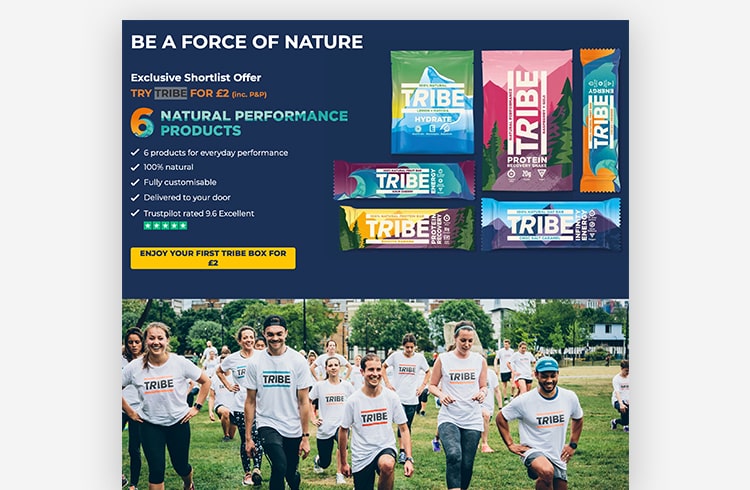
What this ecommerce example reveals: You can make special offers to close more customers
Setting up limited-time deals or special offers on your regular ecommerce shop can be a huge pain. Standard product pages often don’t properly show off a deal, and they can be pretty rigid if, for example, you only want certain people to be able to access the promo.
That’s why this example from TRIBE is worth looking over. Their marketing team set up an “Exclusive Shortlist Offer” on a landing page, so they could carefully control who the promotion went out to—rather than make it available to every single visitor who happened across their website.
Better still, because this is a landing page built using Unbounce, the team from TRIBE had complete control over how they presented the promotion. To help sell the offer, the team incorporated the value of the deal into everything from the CTA (“Enjoy Your First TRIBE Box for £2”) to the subscription details (“Custom built pack and tailored to your needs”). Very smart!
What else we love about this landing page:
- The focus on athletics throughout the page—including a great training photo underneath the hero section—helps visitors understand the value of these natural performance products, and who they are meant for. (Hint: not me.)
- The emphasis on social proof helps make the offer more compelling as well. Not only are there testimonials from a recognizable customer review website, but there are also familiar media outlets and supermarket logos to increase your confidence.
Example #3: Ascent Footwear
Industry: Apparel
Model: Storefront
Page Type: Click-Through
Image courtesy of Ascent Footwear. (Click to see the whole thing.)
What this ecommerce example reveals: You should focus on the product details your customers care about most
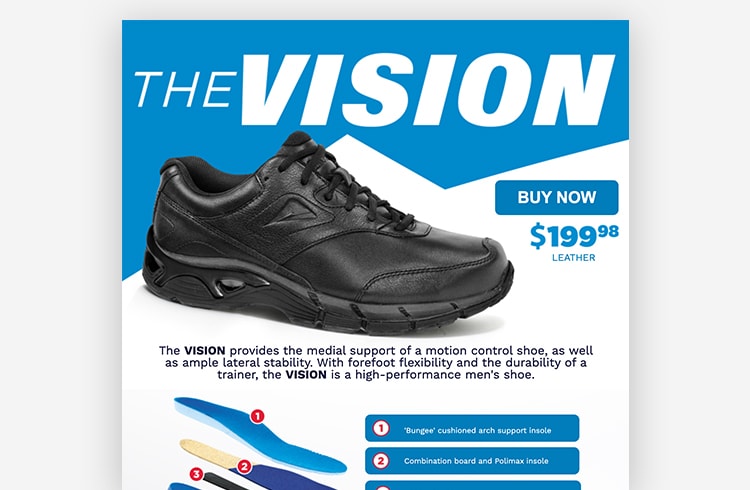
If you’re selling apparel that’s more function than fashion (like a shoe that’s designed to correct your walking stride), it’s important to put emphasis on the mechanics of how your product works. Case in point: this example from Ascent Footwear.
Not only does this landing page show off exactly what goes into each shoe, but it also explains why that makes such a difference. (Now, I just need to figure out what the heck “ample lateral stability” means.) The page removes all the fluff and focuses on answering one very specific question: How does this shoe actually work?
Compare this to most product pages, which often get lost in the details that don’t matter as much. Manufacturer references, lengthy product descriptions, related products—if your customers don’t actually care about these things, they might just be distracting them from making a purchase.
What else we love about this landing page:
- Ascent uses an expanded view of its shoe to showcase the technical components that contribute to its comfort and durability.
- By including an explainer video, Ascent is able to elaborate on the value propositions of the product without taking up much space on the page.
- The clean, single-column layout and short length mean that visitors aren’t being overloaded with information. That way, they can focus on Ascent’s core message.
Example #4: BoxyCharm
Industry: Cosmetic
Model: Subscription
Page Type: Lead Generation
Image courtesy of BoxyCharm. (Click to see the whole thing.)
What this ecommerce example reveals: You can use landing pages to build hype for product launches
Launching a new product is always exciting—but getting the word out to customers can sometimes be a challenge. That’s where this example from BoxyCharm comes into the mix.
To help promote their new upscale beauty subscription box, their marketing team put together a promotional landing page that builds anticipation for the product and directs interested shoppers to enter their email address. This lead generation tactic proved to be quite useful—when the subscription box officially launched, the team at BoxyCharm already had a big list of shoppers who were interested.
Brains and beauty? This example really is the full package. 😉
What else we love about this landing page:
- The sleek layout, on-brand color scheme, and parallax scroll effect all demonstrate that BoxyCharm has a flair for design. Nice.
- The landing page copy helps BoxyCharm’s brand identity with the #hashtag generation, and the social links included make it easy for visitors to engage further.
- The video gives us a look at the process behind the product and shows that BoxyCharm hears (and acts on) customer feedback.
Example #5: Thistle
Industry: Food & Beverage
Model: Subscription
Page Type: Click-Through
Image courtesy of Thistle. (Click to see the whole thing.)
What this ecommerce example reveals: You should always optimize your landing page for mobile devices
Making purchases on your phone is the new norm. According to Google, when people have a negative experience on mobile, they are 62% less likely to make a purchase from your brand in the future. That means for every page you create, you should be optimizing it for smartphones and tablets as well.
This example from Thistle shows how simple it can be to optimize your page for mobile devices. Using Unbounce, they created a landing page for their plant-based meal subscription service that looks stunning regardless of which type of device you’re using.
What else we love about this landing page:
- The page does a great job highlighting the unique value proposition of this meal subscription service: nutrition-optimized, ready to eat, plant-based meals made with high-quality ingredients.
- Thistle knows its audience. They understand how health-conscious their subscribers are, and made sure to include extra info about how each Thistle meal is curated to include the right mix of macronutrients, vitamins, and minerals.
Example #6: waterdrop
Industry: Food & Beverage
Model: Storefront
Page Type: Click-Through
Image courtesy of waterdrop. (Click to see the whole thing.)
What this ecommerce example reveals: You can target specific audiences to get better results
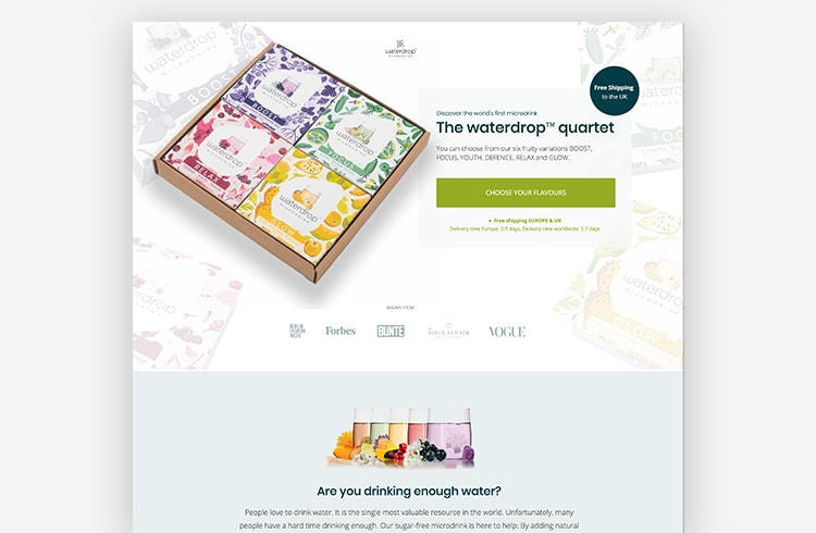
While your product pages typically have to be generic enough to speak to everybody at the same time, you can build landing pages to speak specifically to one particular audience or use case. This example from waterdrop sets the bar for targeted messaging—and, by converting more than half of all visitors, it makes a compelling case for you to do the same.
Everything on this page is meant for one audience: women. Contextual shots? Women. Testimonials? Women. This brand knows who they’re talking to, and their strategy seems to be working.
What else we love about this landing page:
- The design is spectacular and complements the product well. Can colors be flavorful? This landing page says they can, and our abrupt craving for something sweet and fruity makes us believe it.
- The page also does a good job of leveraging social proof by including recognizable media logos and positive customer reviews.
Example #7: Infinite Moon
Industry: Home
Model: Storefront
Page Type: Click-Through
Image courtesy of Infinite Moon. (Click to see the whole thing.)
What this ecommerce example reveals: You should always back up your claims with your best testimonials
Any ecommerce marketer will be able to tell you that reviews and testimonials are some of the most powerful tools in your arsenal. And this example from Infinite Moon and Wallaroo Media shows how you can use them more effectively on a landing page to make a sale.
Whereas on a typical product page you might just automatically surface up the latest customer reviews, the testimonials on this page have been carefully curated to help tell the brand story. Each one touches on an important benefit of Infinite Moon pillows: maximum comfort, serious pain relief, and high-quality materials.
What else we love about this landing page:
- Using lightboxes to give visitors an up-close view of the product and provide additional information means that the page isn’t cluttered.
- InfiniteMoon makes good use of the space above the fold, communicating their value prop through a punchy headline and emotive hero shot.
Example #8: Solo Stove
Industry: Cookware
Model: Storefront
Page Type: Click-Through
Image courtesy of Solo Stove. (Click to see the whole thing.)
What this ecommerce example reveals: You can overcome purchase objections using photos and other media
Are you relying on the fact that visitors will actually read your product descriptions? As a copywriter, I know as well as anyone that (and this is hard to admit) text and bullet points will only get you so far when it comes to overcoming purchase objections. A lot of shoppers skim or skip over the content you write, and they usually end up missing those key product details.
With ecommerce landing pages, you have the flexibility to overcome purchase objections in whichever ways you think will resonate most with your shoppers.
In this example from Solo Stove, their marketing team uses a combination of text and visuals to answer every possible question you might have about the product as you scroll down the page. (“What does it do?” It protects you from the flame. “Where am I gonna store all this?” It all nests inside the stove. “Can you still roast weiners?” With grooved ridges, this shield makes it easier than ever to get your wiener roast on.)
What else we love about this landing page:
- Combining this product promotion with a limited-time 20% off pre-sale offer is a great way to encourage visitors to click through today, rather than wait until tomorrow.
- The footer at the bottom of the page reminds shoppers that they’ll get free shipping, free returns, and a lifetime warranty. All of these promises help to eliminate risk and build trust in the brand.
Example #9: Nathan Sports
Industry: Sport
Model: Storefront
Page Type: Click-Through
Image courtesy of Nathan Sports. (Click to see the whole thing.)
What this ecommerce example reveals: You can get more creative with promotions on landing pages
Consistent visual branding is more important than ever, but it does place limits on how imaginative you can be with your product pages. After all, they have to exist within the greater ecosystem of your online store. You can’t just go changing up the color schemes or formatting for every new product release!
But that’s why so many marketers are flexing their creativity with their ecommerce landing pages instead. Take this campaign from Nathan Sports, for example. It’s so different from the rest of their online store that it demands you take notice (and maybe put on some retro 3D glasses while you’re at it).
What else we love about this landing page:
- The theme is so cool, and Nathan fully commits to it—from the loud, neon visuals, to the flashy animations, to the campaign slogan. Awesome.
- This page might feel like it’s from another era, but today’s best practices still apply. Strong headline, benefits-oriented copy, rule- of-three layout—it’s all here.
- Nathan even includes a custom playlist to help runners get pumped with retro jams from Duran Duran, Blondie, and Run DMC. Someone teach us how to run right now!
Example #10: Meowbox
Industry: Pet
Model: Subscription
Page Type: Click-Through
Image courtesy of Meowbox. (Click to see the whole thing.)
What this ecommerce example reveals: Any landing page can be improved with a couple of cat photos
OK, I’m going to level with you. I was pretty much ready to finish this article… but I just couldn’t resist including this example. Meowbox is a monthly subscription box with toys and treats for your favorite feline. What’s not to love?
What else we love about this landing page:
- It’s one thing for pet owners to say that Meowbox is wonderful, but pairing customer testimonials with pictures of their cats enjoying the treats adds another level of credibility.
- The headline conveys Meowbox’s main value proposition and, paired with the hero shot, helps visitors understand what they’re getting as soon as they hit the page.
- This is a click-through landing page, but Meowbox includes a newsletter signup form as a secondary conversion goal to try and capture those precious email addresses. No lead left behind.
But wait, there’s more! Take a page out of these ecommerce companies’ landing page playbooks
Example #11: The Savile Row Company

The Savile Row Company is a London-based online retailer that offers tailor- and ready-made shirts, suits, and chinos for men, as well as a selection of womenswear. Their website caters to UK, Europe, Australia, and US currencies and they ship all over the world. Smart cookies they are, the folks at Savile Row and their agency, Blimpp, saw this opportunity for targeting and created landing pages for specific segments—like their page for UK shoppers—which to date has converted 74% of thousands of visitors.
That whopper of a conversion rate is likely a reflection of how deeply targeted this page is. It’s not just for UK shoppers, or UK shoppers looking for men’s shirts, but UK shoppers looking for formal men’s shirts. Complete with everything a men’s-formal-shirt-shopper-in-the-UK needs to know about Savile Row’s fits, colors, styles, shipping, and more.
They’ve made great use of the page’s real estate by including a gallery of options and individual calls to action to shop each vertical within them. Slim fit? Navy blue? Button-down collar? Savile Row directs you exactly where you need to go. If you’ve even scrolled down, that is. The hero section has a clear product photo and CTA to grab a deal of three shirts for £80, along with the assurance of free UK returns, free posting and packaging for certain orders, and the credibility of a well-established company. Communicating that right at the top of the page may be all you need to click “Shop Now.”
Example #12: Woodworker’s Guild of America

Woodworker’s Guild of America is a woodworking community that offers tons of instructional and educational videos for woodworkers and woodworking enthusiasts. They have loads of content and products on their site for sale and download—instructional DVDs, online videos, apparel, tools, and more.
In this instance, they’ve cleverly used a landing page to promote their partnership with a popular industry manufacturer and further engage their community. Members can enter the Ultra-Shear Sweepstakes to win a package of Ultra-Shear woodturning tools, a grand prize nearly 54% of visitors so far have signed up to win.
This page hits the nail on the head (heyoooo) for several reasons. The page itself is simple and uncluttered, letting the prize take the spotlight. A clear graphic of the entire tool bundle and its hefty $1,120 USD value leave nothing up to interpretation, while the large Ultra-Shear logo communicates their alliance with a quality brand. All of this information is located above the fold, along with a simple form to enter. If visitors want more, they’ll find it below with a description of each tool included in the prize, its features and benefits, and a link to find more product details.
Example #13: The Coffee Network

The Coffee Network is an online marketplace based in Australia that connects home brewers, cafe owners, and office managers with local coffee roasters. Through TCN, they can choose from a huge variety of specialty and gourmet coffee and espresso blends to buy individually, as roaster bundles, or wholesale.
Their Coffee Finder landing page, converting at 45%, makes the search for the perfect brew even easier, guiding coffee lovers through a three-step process to customize their order based on roasting method, strength, and flavour preferences. The headline is super clear, benefits-led, and visitor-focused, with supporting copy that explains exactly why visitors should use the Coffee Finder right above a call to action encouraging them to give it a whirl. All of this is laid over a video background of a silky, rich coffee brew in progress.
Bonus points for the “How it Works” headline nudging visitors down the page, succinct instructions conveying the simplicity of the coffee-finding process, and charming iconography as visual communication.
Example #14: Heyday

Heyday is a New York- and LA-based skincare company that aims to make quality skincare and treatments accessible to everyone. They have several brick-and-mortar locations as well as an ecommerce shop and monthly membership, offering in-spa facials and retail skincare, a huge range of products purchasable online, and free expert content.
The page we’ve chosen to highlight—announcing the arrival of a new spa location in Silver Lake—is as simple as it is effective, and a stellar example of using landing pages to generate buzz and gauge interest well before a launch. Its beautiful, colorful design, unmissable emphasis on location, short blurb that summarizes Heyday’s unique selling proposition, and simple one-field form add up to a page that’s converted 65% of several thousand visitors. That means thousands of leads, thousands of validations that Silver Lake is a 💯 spot to open up, and of course, thousands of potential customers.
Blending in a chance to win a three-month membership and offering a bonus entry for following Heyday on Instagram certainly don’t hurt either, both as an added incentive to sign up and a chance for Heyday to further engage the local community.
Example #15: Xpand No-Tie Laces

Xpand is a no-tie, elastic shoelace system that can be installed on any shoe or boot to create adjustable, higher performing, fuss-free footwear. Since raising $1.2 million in crowdfunding to support their launch, they’ve quickly expanded their business and product offerings to meet demand.
As a relatively new product, Xpand’s “Freebie” landing page is a particularly smart way to draw in new customers. It offers a totally free pack of laces—no purchase required apart from the $2.99 shipping—so interested visitors can try out the laces before they buy them.
This page is heavy on building trust—besides the act of backing up their product with a free sample, Xpand has included several nods to their credibility. They let visitors know that over one million packs have already been sold, as well as adding a logo bar of media features (no big deal, they just appeared on Ellen). They also added a handy series of gifs showing how easily the laces can be installed, how they contour to the movement of your foot, and exactly what they look like in visible and hidden mode.
Example #16: Marley Spoon
Image courtesy of Marley Spoon. (Click to see the whole thing.)
Marley Spoon is a meal prep service that makes cooking quality, homemade meals super easy and convenient. They deliver fresh, locally-sourced ingredients for meals you’ve selected right to your door, with step-by-step recipes to whip them up in no time.
Their “Perfect Dinner” landing page draws visitors in with drool-inducing photos of a few delicious dinners you can create, then clearly and visually lays out their value propositions and a list of overall benefits to the subscriber. All peppered with bright, clear calls to action to “Start Cooking” once all those food photos have gotten you nice and hungry. The top of the page contains a navigation to see all of the current recipes on offer, learn exactly how their service works, and a gentle CTA to sign up. At this time, the page is converting at a cool 25%.
Not quite ready to sign up? For those on the fence, Marley Spoon has added an Unbounce Popup to get their newsletter. As subscription-based services may have a higher barrier to entry than a one-off purchase, this is a brilliant way to capture leads so they can continue to nurture visitors toward converting, and bring bounced traffic back.

Example #17: Spa De Soleil

Spa De Soleil is a leading developer of private label, custom, and pre-formulated skin and hair care products. They offer everything from brand consultation, packaging, and graphic design to custom formulation and regulatory guidance for their clients.
This landing page, targeted at private labels, is a clever way of outreaching and educating prospective clients on their services. Its call to action is to download their private label handbook, allowing them to share their expertise and add to their credibility as leaders in the beauty industry. In lieu of a more direct call to action, they’ve decided to promote a content offering. Not only is this a softer approach for the visitor, it gives Spa de Soleil an opportunity to gain info on prospective clients with a detailed form that asks for company, type of business, products they’re interested in, location, and more.
The photo they’ve chosen for the hero section helps convey the research, development, and formulation services they provide—you can trust that they’re the ones behind every product created. They also instill trust with client testimonials and a list of certification logos, including USDA Organic, Natural Products Association, Cruelty Free, and more, backing up their commitment to natural and environmentally-conscious products. At the bottom of the page, they list only their customer service number, which adds to the feeling of helpfulness. It’s all about learning how Spa de Soleil can help the client instead of trying to sell to them right off the bat.
Example #18: ColdCalm

Boiron is a manufacturer of homeopathic medicines with a worldwide reach of 20 foreign subsidiaries and distribution in 50 countries. Their ColdCalm landing page, to promote one of their cold formulas, is a great example of customizing pages for targeted products.
It’s simple and to the point, with a clear headline and list of symptoms ColdCalm treats above two calls to action empathetic to someone who may be or know someone suffering from them—you can either locate a store to find instant relief or purchase online for future sniffles. An overview of benefits, safety, and product differentiators like quick-dissolving tablets and no known drug interactions address any immediate concerns.
Two customer reviews coupled with a list of reputable, well-known stores that sell ColdCalm create that sense of trust especially important in the healthcare industry. An extra touch, particularly for those interested in natural, homeopathic remedies, is a link to learn absolutely everything about the medication, from its ingredients and the symptoms they relieve, to storage and safety, directions, and more.
Example #19: Gradshop

Gradshop is a manufacturer and distributor of premium graduation apparel and accessories. They service over 1,000 schools across the world, from pre-schools to universities—so they have a LOT of orders, customers, and inventory to manage at any given time.
Their landing page to order a free graduation planning kit is a great way to streamline the purchasing and order customization process, and ensure customers are satisfied with their product choice before placing an order. This undoubtedly reduces the load on their support team to fix or return orders after the fact, and creates a better customer experience overall.
There’s no having to guess what’s included in the kit with a bullet list and photo examples detailing every item—a ton of free samples, color swatches, order forms, and a trusty ebook on graduation planning tips. Choosing a longer form with several information fields is a smart choice considering the value the free kit provides and the convenience of getting that information up front. It allows customers to give specific parameters for their order, and Gradshop to collect information to better understand the orderer and cater to their needs.
Example #20: AWAY: The Survival Series
Image courtesy of AWAY creators. (Click to see the whole thing.)
The AWAY Series is a yet-to-launch video game that puts you in the role of the crafty sugar glider as you fight for survival in the wild. It’s another awesome example of using landing pages before a product is out in order to measure interest and lengthen the promotional runway time.
The AWAY pre-order page piques interest with an immersive, story-like layout featuring gorgeous game imagery, video backgrounds, and a video embed of the full game trailer. Information about the game and its features unfold as you scroll down the page and get sucked into the world of AWAY and see it through the sugar glider’s eyes. The call to action is simple—sign up for a newsletter to be on the waiting list. Now, AWAY’s creators have a list of interested players to contact when the game is ready for launch, and a buildup of anticipation they can leverage for promotion.
Example #21: Mr. Draper
Image courtesy of Mr. Draper. (Click to see the whole thing.)
Mr. Draper is a curated clothing service for men, providing stylists who consult on your style preference, budget, and sizes before sending a custom clothing box to try on during a five-day window. Buy the items you love, and the ones you don’t will be picked up by the Mr. Draper team.
Their “Your Stylist” landing page, one of their best-performing pages at a 32% conversion rate, is extensive, thorough, and empathetic to the shopper’s needs. It gives the shopper every detail they’d want to know about the Mr. Draper process, brand, benefits, customer testimonials, pricing, frequently asked questions, and stylists, with brightly-colored buttons to start building a style profile calling attention in each section.
While the entirety of the landing page includes oodles of information for any visitors who may need it, the section above the fold may well render that unnecessary. It’s effective enough on its own to engage those who are more inclined to dive right into the signup process, with a clear explanation of Mr. Draper’s brand and benefits, a call to get started, a photo background displaying some of the clothing available, and logos of media they’ve been featured in to show they’re the real deal.
Example #22: Porcelain
Image courtesy of Porcelain. (Click to see the whole thing.)
Porcelain is a successful Singapore-based skincare brand that offers customized skin analysis, tailored skincare regimens, in-spa services at four gorgeous locations, and a wide collection of skincare products purchasable from their site. Their “Skin Discovery” landing page invites visitors to submit their interest for a personalized Skin Analysis at one of their locations.
It actively leads the visitor down the page with anchored CTAs linking to relevant sections with more info, or to book an appointment. Photographs of people are used heavily, showing a model with clean, glowing skin as the first image, friendly skin therapists helping clients, and a client being cared for. This emphasizes the personalized attention and human approach they’re committed to, allowing the visitor to envision themselves luxuriating in the Porcelain process on the way to more beautiful skin.
As you’re led down the page, transparency and trust are established—the level of detail they take in assessing your skin, explanation of the holistic approach they take, information on their skin therapists’ training, and the three-step process that can be booked at the bottom of the page. Its guided experience, human focus, and thoughtful detail put into each step of information is reflective of their philosophy and tender approach to your skin.
Example #23: Talo Brush
Image courtesy of Talo Brush. (Click to see the whole thing.)
Talo Brush is a smart toothbrush that syncs to an app monitoring your brushing activity so you can keep better tabs on your oral health. It’s yet another example of using landing pages to build a waiting list pre-launch, something we’re seeing more and more use cases for.
Talo Brush makes smart use of their landing page, featuring a photo of a woman with a big, bright smile and choosing crisp, clean blues and whites for their color scheme. The headline—just four words—both describes the product and weaves in benefits, while the supporting copy clearly communicates a main selling feature with the user in mind. Talo Brush isn’t “the fastest electric toothbrush.” Rather, it “Cleans your teeth perfectly in just 20 seconds.”
As you scroll, a problem is introduced before offering Talo Brush as the solution. If 50% of the population is afflicted by dental health issues—and this number hasn’t changed in the last 25 years—it’s time for some much-needed innovation. As mentioned when it comes to healthcare, trust and credibility is incredibly important. The photos, titles, and credentials for the team behind Talo Brush—including several dental and healthcare professionals—gives prospective customers all the more reason to believe in the product claims.
Example #24: Vanity Planet
Image courtesy of Vanity Planet. (Click to see the whole thing.)
Vanity Planet is a one-stop online shop for all things skin, hair, health, and well-being. They use landing pages for individual product pages and promotions, like this one by digital agency MuteSix, for their Raedia Facial Cleansing Brush. It’s an excellent example of granular targeting on a product basis instead of relying on shoppers to browse the entire site.
Lots of white space and high-resolution photography show the quality of the models’ skin to give a visceral feeling of cleanliness and vitality. The “Shop Now” CTA at the top anchors directly to the section where you can buy the cleanser straight from the landing page, with a hefty discount made clear by including the original price.
For shoppers who prefer to browse the page, there’s a lot of information readily available for them: A large promotional video, product benefits and a dissection of features, and customer reviews. At the same time, an unimposing Unbounce Sticky Bar linking to the purchase section scrolls along with them. And why not grab a cleansing solution or brush replacement pack while you’re shopping? A gallery of related products is available to add to your cart in a single click.
Example #25: Awayco

Awayco is a marketplace to rent premium equipment for surfing, skiing, biking, snowboarding, and more, all around the world.
They use targeted landing pages to promote and book specific items, like this one for a custom surfboard they created in collaboration with OneWave and MF Softboards. This works twofold, as a way to promote their service and their partnership. They include a section on OneWave, a non-profit surf community dedicated to raising awareness of mental health through saltwater therapy and surfing. This way, visitors know that when they book this board, they’re supporting a great cause. And that when they use Awayco, they’re supporting a company that supports great causes.
They’ve also embedded a map to show rental locations, making the booking process easy as pie when you’re trying to find the closest shop. And the large shot of their board with the Awayco and OneWave branding, on a quiet beach with the calling waves, is a fine use of their hero section.
Example #26: Patrick Adair Designs
Image courtesy of Patrick Adair Designs. (Click to see the whole thing.)
Patrick Adair Designs is a luxury jewelry company that started in 2015 when Patrick turned his first-ever purchase of a carbon fiber slab into his first-ever creation of a carbon fiber ring. Soon after, he launched a Kickstarter campaign that has since grown into Patrick Adair Designs, with a range of unique, beautiful rings crafted from uncommon high-quality materials like their trademarked Glowstone.
This landing page, another of MuteSix’s creations, is a genius way of providing an extra level of service to both existing and prospective customers. Offering a simple $10 ring sizer gives shoppers assurance they’ll get the perfect fit, emphasizes the attention to detail and customization provided with each ring order, and shows that customer experience is top-of-mind. A $10 credit included towards a future ring essentially cancels out the ring sizer purchase itself, and gives browsers a reason to come back—turning a small sale into a big one. And it’s currently converting at 34%.
Alongside information about the ring sizer, how to use it, and calls to action to “Buy Now” and “Get Your Fit” are a healthy dose of customer testimonials, influencer shout-outs, and details on the process and shipping for Patrick’s custom-made rings to give shoppers everything they need to know before being directed to the product gallery.
Example #27: Troubadour
Image courtesy of Troubadour. (Click to see the whole thing.)
Troubadour makes bags and accessories that skillfully balance performance with modern refinement. They’re engineered to go from boardroom to mountains, combining smart, sophisticated styling with the rugged endurance required for outdoor use.
Also designed by the folks at MuteSix, Troubadour’s landing page for the Explorer Quickdraw Rucksack takes advantage of every inch of real estate to showcase a new product. A strong headline over a large, professional product photo immediately draws visitors in, with a call to action button anchored to a selection of rucksacks so they can shop directly from the page.
There are several sections to address shopper questions, build trust, communicate Troubadour’s company philosophy, and explore every aspect of the Explorer Quickdraw Rucksack in a variety of mediums. From customer testimonials, product features and benefits, a video going over the rucksack in detail, an Instagram gallery, to their no-commitment return policy and five-year guarantee, there’s no guesswork or leaps of faith required by the customer to hit that “Shop Now” button.
What do the best ecommerce landing pages have in common?
The best ecommerce landing pages target one specific audience, focus on a singular CTA, and include just enough persuasive elements to help a shopper convert. They also:
- Show off the product in multiple different ways
- Make special offers to close more customers
- Focus on the details shoppers care about most
- Build hype for future product launches
- Optimize the shopping experience for mobile devices
- Target specific audiences
- Back up claims with real testimonials
- Overcome purchase objections
- Get more creative with special promotions
Oh, and I should also mention that all of the examples featured in this article were built using Unbounce. If you’re interested, you can check out some of our high-converting ecommerce landing page templates to get started on your own today.






![How to Optimize for Google’s Featured Snippets [Updated for 2024]](https://moz.com/images/blog/Blog-OG-images/How-to-Optimize-for-Googles-Featured-Snippets-OG-Image.png?w=1200&h=630&q=82&auto=format&fit=crop&dm=1724004002&s=13df73104762982790dab6dc8328023f)
