
A great graphic design portfolio can’t move mountains, but it can change your life with a new job or opportunity. AI and other factors are impacting graphic design hiring, making your portfolio more important than ever before.
While some designers still carry a physical book of printed design examples, most portfolios are graphic designer websites. These sites show audiences much more than design skills like logo design or typography.
Whether you’re a full-time graphic designer or dabbling in design as a freelancer, it’s critical you create a sleek graphic design portfolio to showcase your work to potential clients.
Fortunately, we’ve created a list of over 20 impressive graphic design portfolios, followed by instructions on how you can create your own. Keep reading to get all the tips you need to curate the perfect space to showcase your work.
What is a graphic design portfolio, and why does a graphic designer need one?
A graphic design portfolio is one of the most important elements a client or employer needs to see when choosing a graphic designer. A portfolio should include a selection of a graphic designer’s best work, as well as professional samples from client projects.
If you’re a graphic designer a portfolio is essential for proving your design skills. It’s also a chance to:
- Share your design process
- Talk about design or industry specialties
- Showcase your unique style
A graphic design portfolio, like a resume, will also include contact information. It may also feature case studies from past employers.
Most portfolios today are graphic designer websites. This means that they’re not only a way to connect with clients. They also help graphic designers build communities and share their work with potential fans around the world.
So what does a graphic design portfolio website need to include to stand out? Your portfolio is much more than proving you know how to use Photoshop. Many graphic designers will include logos, typography, print design, or web design in their portfolios.
And, some of the best graphic design portfolios today may also include:
As you’ll see below, the most powerful graphic designer portfolios balance personal vision with standout client samples.
Graphic Design Portfolio Website Examples
- Jessica Walsh
- Morag Myerscough
- Heather Shaw
- Mike Mills
- Mohamed Samir
- Gail Anderson
- Gleb Kuznetsov
- Stefan Sagmeister
- Lotte Niemenen
- Luke Choice (Velvet Spectrum)
- Sophia Yeshi
- Eduardo Nunes
- Stefanie Brüeckler
- Chip Kidd
- Ryan Dean Sprague (Pavlov)
- MDZ Design
- Alex Trochut
- Leandro Assis
- Peter Tarka
- Tobias van Schneider
- Aries Moross
- Ling K
- Nisha K. Sethi
Let’s look at some graphic design portfolio website examples to inspire and motivate your portfolio development. You could be a traditional graphic designer or experimenting with new media. There’s something here for everyone.
1. Jessica Walsh
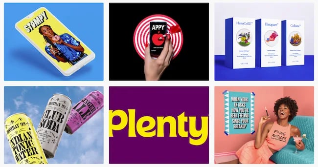
The design industry is competitive. It takes eye-catching imagery and typographic finesse to create a portfolio that draws top clients like Apple, Benefit, and Levis.
This portfolio comes from a designer who’s been named one of Ad Age’s “Top 10 Visual Creatives,” among many other accolades. Currently a design professor, creative director, and head of creative agency &Walsh, this designer’s portfolio on Behance makes great design the focus.
Why we love this graphic designer’s website: Walsh’s approach to type is bright, graphic, and complex. Her style also favors lush colorful photography and illustrations. This could get overwhelming, but this graphic designer is an expert with negative space, using careful visual composition to draw the eye and make a statement.
2. Morag Myerscough
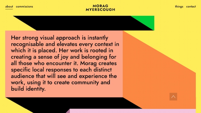
Bright graphics, animations, and clean design make this an exceptional graphic design portfolio. This approach is great for designers who lean into the art of design. It also works for designers who take on more experimental or site-specific projects.
Why we chose this graphic design portfolio: Myerscough’s aesthetic is unique and this image-focused site quickly communicates her style.
Short sections of copy connect her visual brand to her background, professional experience, and personal philosophy. The combination makes the site feel like it shows the whole designer, not just a visualization of the work she does for clients.
3. Heather Shaw
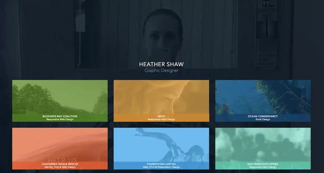
This graphic design portfolio website includes samples of book and website designs, branding, and more. It’s good for designers who work in many different media but want to present a cohesive portfolio.
Why we chose this graphic design portfolio: Heather Shaw’s portfolio is super clear and easy to navigate. It shows a wide range of skills and approaches to solving client problems, but it’s also visually consistent.
The designer also uses text effectively to explain each project and to encourage further engagement with the work.
4. Mike Mills
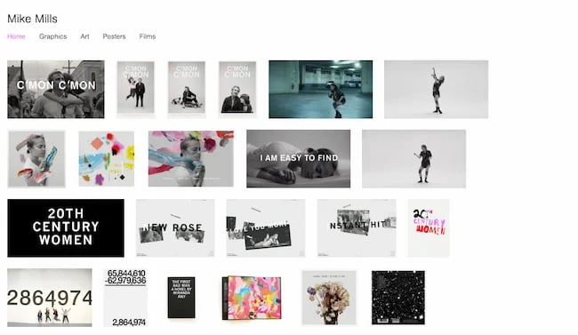
Mike Mills is a talented designer, artist, and filmmaker, known for his punk aesthetic and original style. His portfolio is a reflection of his diverse interests and skills. The website offers a quick lesson in clean design, with easy-to-understand headers, professional photography, and crisp layout.
Why this is a great example of a graphic design portfolio website: When you’re a design beginner, creating your first graphic design portfolio, you quickly learn the importance of editing.
For example, a logo for your first-year graphic design class might have been your best work then. It shows that you know how to use Illustrator or other design software alternatives. But five years later, you have to ask — does that logo belong in a professional portfolio?
As your body of graphic design work grows, you’ll find yourself making tough decisions about what to include, and just as important, what to leave out of your portfolio.
This portfolio example stands out because Mills has found a way to include samples of design that span from the 90s to today. This could easily feel disjointed or overwhelming. Instead, it’s a beautiful and cohesive portfolio with exceptional attention to detail.
5. Mohamed Samir
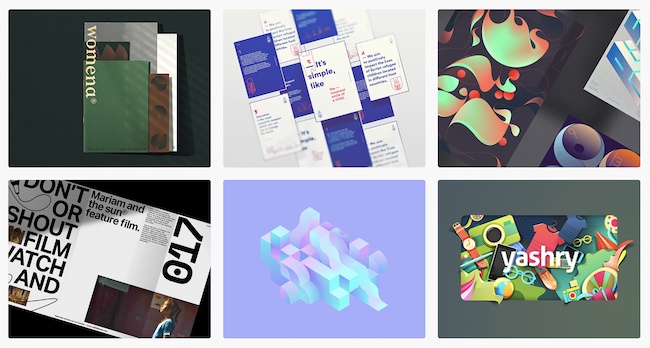
Samir’s work includes branding, typography, posters, and print design. So, this graphic design portfolio zeros in on a tight collection of award-winning designs.
This graphic design portfolio is on Behance. This makes it a good fit for graphic designers who want an online presence without designing their own website.
Why we love this graphic designer’s website: Besides the high quality of the design work, this portfolio shows a diverse range of approaches to typography and style. At the same time, it shows a consistent vision and passion for visual communication.
The printed design work is also well-photographed. While the designer could have added a digital file instead, the photographs give you a better sense of the final polished design.
6. Gail Anderson
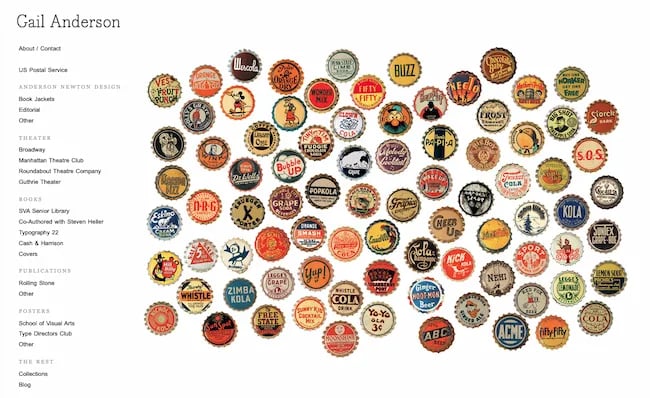
Image quality matters. And if your portfolio pieces include a lot of detail, you may get stumped with your online portfolio design. This graphic design portfolio website has a simple left-hand navigation. So, with each click, you have a chance to see detailed posters, book covers, and more at a scale that shows how they look for print while also being easy to scroll on a mobile phone.
Why we chose this graphic design portfolio: Anderson’s work is smart and timeless. Each piece shows her dedication to the depth and value of design thinking, technical skill, and passion for design.
7. Gleb Kuznetsov
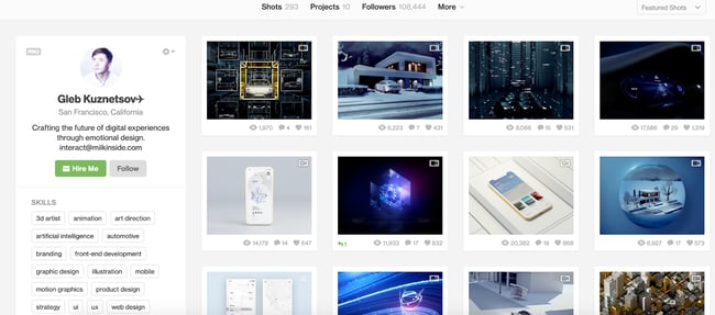
Kuznetsov’s portfolio combines product design, user experience, and graphic design to create something entirely new. This Dribble-hosted portfolio has over 50 images, which could be overwhelming. But they’re split into seven easy-to-understand projects.
This makes it a great graphic design portfolio example for designers who want to show long-term or complex projects.
Why this is a great example of a graphic design portfolio website: From the images to his brief “About” statement, this designer makes his unique vision and personality part of the work and its presentation.
8. Stefan Sagmeister
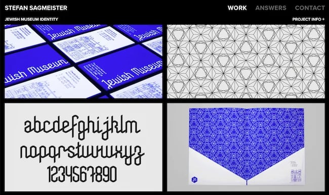
Sagmeister is a legend in the design world, and his website reflects the curiosity and power of the designer. The home page features a grid of images with text that appears as you scroll over each image. With a click, you’re presented with images and/or videos that show the details of each project.
The site is a mix of collaborations, art projects, and more traditional design, like the corporate identity for the Jewish museum.
Why this is one of the best graphic design portfolio websites we’ve ever seen: This portfolio site doesn’t just show the quality and technical ability of the designer. It also gives any client working with Sagmeister a sense of what the design process might be like.
Quick note: The “answers” section of the site is full of useful advice no matter where you are in your designer journey.
9. Lotte Niemenen
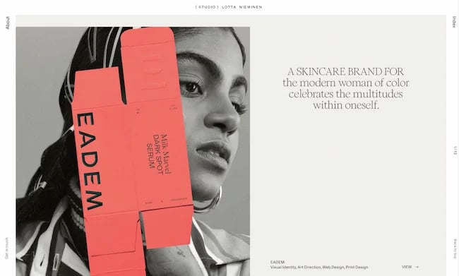
Great designers often let the work do the talking. That’s certainly true here, with a streamlined graphic design portfolio that calls attention to client deliverables. When text is present, it adds to the value of the work, like sharing what parts of the design process their team completed. This is a great portfolio format for designers doing graphic design work like:
- Logo design
- Branding
- Packaging
- Product design
Why we chose this graphic design portfolio: This group of work is simple and to the point. It also shows off a wide range of skills and tactics with a consistent vision. Be sure to take a closer look at the website navigation — it’s clean and exciting while adding to the functionality of the site.
10. Luke Choice (Velvet Spectrum)

3D animation is an exciting design form that’s growing in popularity. But if you’re a client who’s not in the market for an animated billboard, it may be difficult to figure out how you might use this creative form for your business.
This site is a great example of a portfolio that educates with simple text, graphics, and video. It gives both a quick look and a deep dive into how this designer approaches his art form.
Why we chose this graphic design portfolio: If you’re doing something interesting and new, it may be a selling point. But truly new ideas can also challenge or frustrate people who don’t feel “in the know.” This means that your portfolio can’t just sell your designs. It also needs to teach viewers about the new format you’re using and why you think it’s important.
11. Sophia Yeshi
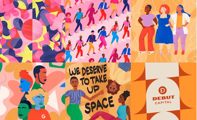
A clear header and tile design emphasize work samples from this powerful graphic designer.
While the tiles emphasize the designer’s unique style, you can click on each tile to get the full details about each project. This is a great approach for designers who want to share the deeper story behind each project while still making the site easy to navigate.
Why we love this graphic designer’s website: A distinct style is important in graphic design. That said, it can be tough to show how many ways you can apply that distinct style in a business context. Major brands, including Google, Nike, and Comcast, use Yeshi’s unique illustrative voice to speak for their brands.
This website portfolio makes that point clear, while still making graphic design the focus.
12. Eduardo Nunes
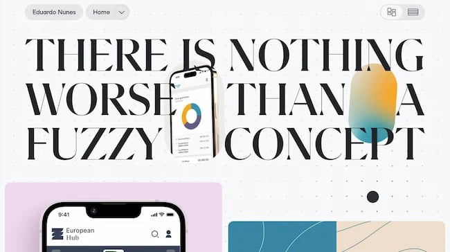
Designers often have a muse — someone or something that inspires and motivates them when the designing gets tough. Sometimes that inspiration can serve as a starting point for your portfolio design, as it did for this design portfolio example.
The landing page starts with a quote from Ansel Adams, “There is nothing worse than a sharp image of a fuzzy concept.” Then, using clean motion graphics and fresh design, Nunes points to a central theme, a philosophy that guides his design approach. This leads every site visitor on a journey through his portfolio.
Why we chose this graphic design portfolio: This portfolio shows intense work, focus, practice, and care. It’s an excellent model for anyone who wants to show the world what they’re creating and why.
13. Stefanie Brüeckler
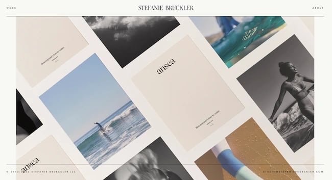
This portfolio includes packaging design, illustration, and web design as well as graphic design and branding work. It’s one of our favorite graphic designer websites because it’s clean and easy to navigate.
It also shows a lot of different examples of work at a glance. This makes it a great example for designers who aren’t sure how to organize all the work they want to include in their portfolio.
Why we love this graphic designer website example: Brückler’s graphic design portfolio focuses on the tiniest of details to create an excellent user experience. From the simple page-loading animation to the thoughtful use of motion graphics, this designer hones in on the stunning details.
14. Chip Kidd
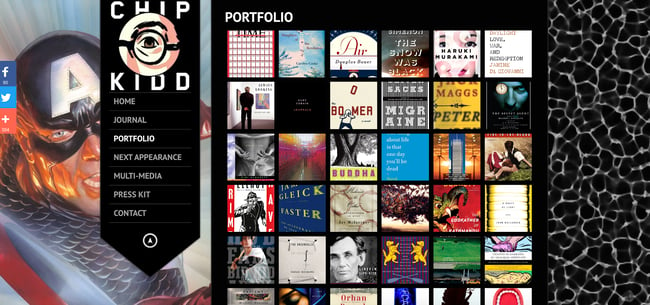
Book cover designer Chip Kidd’s graphic design portfolio website uses lightbox-style pop-ups. Popups make it easier to focus on each book cover. This is a smart way to narrow in on the visuals with a graphic design site while still making it easy to see all the work in one place.
Kidd uses a range of different styles for book covers, and it’s edited in a way that makes this range look natural and exciting instead of chaotic.
Why this is a great example of a graphic design portfolio website: The dark background makes this graphic designer’s style pop. And the simple side navigation gives users a quick path to learn more about the designer and his work.
15. Ryan Dean Sprague (Pavlov)
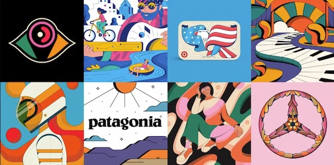
This Texas designer’s style is heavily influenced by music. So, this portfolio features illustration and design work that’s bright, evocative, and fun. This portfolio website shines because it keeps the UX and site structure super simple. This puts the focus on a tight curation of exciting design samples.
Why this is a great example of a graphic design portfolio website: If you have a distinct illustration or design style, the tough sell for your portfolio may not be how good your work is. Instead, you may need to focus on showing the client how you can do your best work for their needs.
This graphic design portfolio is a vivid display of individuality that also shows clients how this designer can help them sell their product or brand.
16. MDZ Design
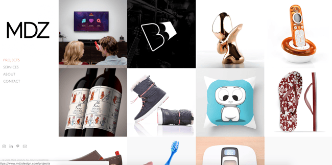
Concise and exciting images on this graphic designer website example give site visitors a peek at execution and strategy.
MDZ Design also offers product design and strategy to clients. This makes their graphic design portfolio a useful example for strategy-focused designers.
Why we love this graphic designer website example: The range of services this portfolio shows could be overwhelming or confusing. Instead, it’s a chance to see their approach to problem-solving. They also make it easy to see how their process leads to results for their clients.
17. Alex Trochut
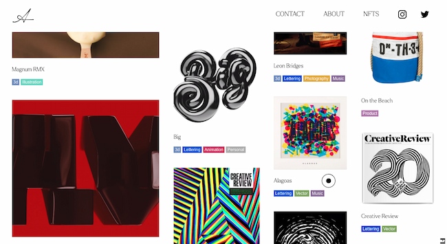
This graphic design portfolio is also a home for Trochut’s product design, animations, music, and NFTs. It’s a great example for multimedia artists who want to present their work on a single website. It also works for creators with a big collection of work to show.
Why we love this graphic designer website example: The four-column layout of this site shows image thumbnails of varying sizes. Each column moves at a different pace as you scroll down the page.
This motion feels dynamic and exciting and reinforces this designer’s original takes on color, type, and layouts.
18. Leandro Assis
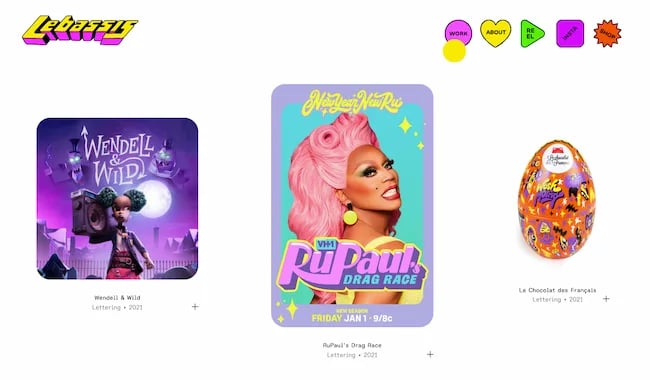
Sometimes a graphic design portfolio isn’t just about a style — it’s about a vibe. This exceptional portfolio comes from designer Leandro Assis.
From brand identity to hand lettering to package design, this portfolio displays a wide range of design skills and original style.
Why this is a great example of a graphic design portfolio website: It’s not like this portfolio isn’t enticing to the eyes. It’s fun, bright, and a little wild. But what makes this portfolio excellent isn’t just the quality of the work, it’s the experience.
Fun icons, engaging UX, and lots of white space make this bold and playful site a pleasure to peruse.
19. Peter Tarka
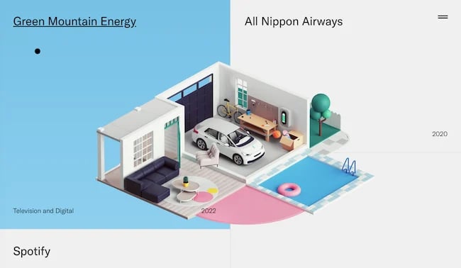
If you’re a self-taught graphic designer, you might have less guidance on where to start with your portfolio website. Look no further for inspiration than the interactive design portfolio for Peter Tarka.
Best known for captivating 3D motion graphics like the ones featured in the video below, Tarka started with a love of architecture and vector graphics that’s grown to a career working with top brands like Spotify, Google, and LG.
Why we love this designer’s website: The fewer clicks it takes to show people what you’re doing the better. This site isn’t just low-click, it’s no-click.
A simple scroll shows you the work, client, and completion date for 15 exceptional portfolio pieces. If you want to see more, a quick click at the top-right brings you to more work samples, links to other portfolio sites, and contact information.
20. Tobias van Schneider
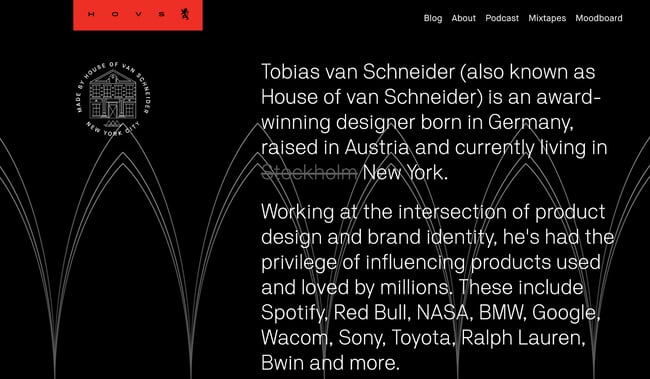
This graphic design portfolio website uses a range of type sizes and contrasts to emphasize the ideas it communicates. This is a great approach for entrepreneurial designers. It’s also smart for anyone who collaborates in their design work.
Why we love this graphic designer’s website: A sticky header and big blocks of color and text make this graphic designer website interesting to explore. This site also uses scale well. It combines big images with both big and small text to emphasize each client project.
21. Aries Moross
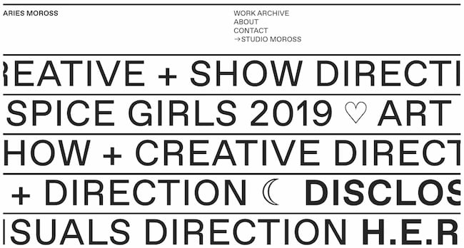
There are many ways to play up a unique style, and this graphic design website highlights this designer’s recent work as well as a full project archive. This is a great example for designers who also do illustration.
Why we chose this graphic design portfolio: Moross uses space effectively on this site. It’s easy to get an immediate sense of the designer’s distinct style. The simple navigation helps users refine their search to target a specific type of work, like hand-drawn fonts or editorial design.
22. Ling K
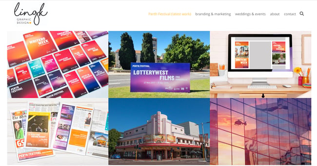
LingK’s portfolio features their latest project while also showing other industry niches. The structure of the website helps prospective clients quickly decide if they want to work with this designer.
Why this is a great example of a graphic design portfolio website: It can be tough to convey how campaign materials for a complex event, like a wedding or conference, work together. This designer effectively shows the breadth and depth of work for each project and makes it easy to see the value of each deliverable.
23. Nisha K. Sethi
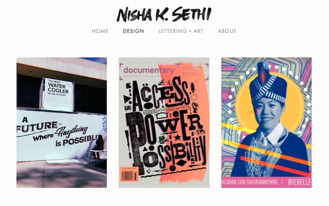
Sethi’s portfolio is simple and straightforward. It puts the spotlight on each design project. The “About” section also tells a clear story that encourages further questions and conversation.
It can be tempting to tell an audience everything on your website. But a great portfolio should offer enough samples to entice clients to reach out and learn more, but not so much that it overwhelms. This website is a great example of offering just enough.
Why we love this graphic designer website example: This graphic design example combines hand-lettering, printmaking, and other media with digital design. While this designer works in a range of media, their portfolio shows a strong voice that is effective across many channels.
Looking for more design portfolio inspo? These designers and design studios may not be a model for your personal portfolio website, but they’re great design resources:
If you’ve finished your portfolio pieces and want to get more website design ideas, check out this free lookbook with over 70 examples of incredible websites.
How to Make a Graphic Design Portfolio
- Curate your best work, and show a wide breadth of skill.
- Choose the right platform to showcase your work.
- Include a professional case study, or client recommendations.
- Integrate your personality.
- Describe the creative process.
- Show non-client work, or side projects.
1. Curate your best work, and show a wide breadth of skill.
Lindsay Burke, a HubSpot Product Designer, emphasizes the importance of quality over quantity when it comes to curating a graphic design portfolio. She says, “I recommend selecting your strongest projects and making these the primary focus of your portfolio website.”
Ideally, your portfolio will feature your sharpest, most impressive 10-20 designs — undoubtedly, someone pursuing your portfolio won’t have the time to look at more, and if your first couple projects are impressive enough, they shouldn’t need to.
But it’s equally critical you show potential clients your versatility. If you’ve dabbled in logo design as well as video animation, it’s good to include both kinds of projects in your portfolio.
2. Choose the right platform to showcase your work.
Investing in a quality website with a custom domain URL will pay off in the long run by demonstrating your professionalism to potential clients.
Having your own website helps you organize your portfolio to suit all your business needs — for instance, perhaps you’ll include ‘Projects’, ‘About Me’, and ‘Contact Me’ sections, so visitors can peruse your content and then contact you without ever leaving the site.
Take a look at this list of the best website builders if you need help choosing a platform for your portfolio.
3. Include a professional case study or client recommendations.
Lindsay Burke told me it’s incredibly valuable to write out a case study to complement any website visuals — “Through a written case study, your site visitors can get a sense of your project’s background, the problem you were aiming to solve through design, and the process you took to arrive at a final deliverable. A lot of time, effort, and iteration goes into design solutions, and a written case study will help communicate your unique process.”
To cultivate a strong case study, consider including the background of the project, the problem, the process, your deliverable, and any next steps.
In the process section of your case study, Burke suggests including research, experience mapping, persona development, wire-framing, sketching, usability testing, and iteration.
Plus it will impress future clients if you can include recommendations from prior employers, which allows you to display a level of professionalism.
4. Integrate your personality.
As you can see in the examples above, each portfolio is drastically different depending on the artist’s unique style. Someone checking out Tobias van Schneider’s portfolio will expect something vastly different from someone looking at Ling K’s site. Make sure your portfolio — including layout, background, and website title — reflects who you are as a designer.
5. Describe the creative process.
Each designer has a unique process when working with clients — and the sooner a potential client can learn about your process, the better. It’s important you include context, so visitors can get a sense of how you handle challenges, and how your designs solve real-world problems.
Plus, including a description of your creative process can help a potential client figure out whether you’re capable of handling the scope of their project.
For instance, they might be unsure of your ability to handle graphic designs for mobile until they read how you single-handedly brainstormed and created the designs for another client’s mobile site. In this case, context is critical.
6. Show non-client work, or side projects.
Amanda Chong, a former HubSpot Designer, says, “Side projects are a great way to demonstrate your will to take initiative and your ability to balance multiple things at once. They’re also a great way to show some of the more experimental, creative ideas that you might not be able to show through your day-to-day work.”
If you’re just starting out, it’s acceptable to include side projects or non-client work so potential customers can get a sense of your ability and style.
Consider incorporating school work, a logo you designed for your aunt’s company, or an internal design you created for your current company — ideally, your designs will negate any concerns potential clients have over your lack of career experience.
Graphic Design Portfolio Ideas
- Help a local business or start-up with its design and brand.
- Create content for your own personal brand.
- Redesign an existing website.
- Create graphic design materials for a made-up company.
- Design a logo for a brand you love.
- Create a stock theme for WordPress.
- Take part in a design challenge.
1. Help a local business or start-up with its design and brand.
One of the easiest ways to begin building your client base is by contacting nonprofits or local businesses in your area. Think about creating mock-ups or sketches in advance, These can help you give businesses a sense of your skill and vision.
Perhaps you think a local restaurant needs a new menu logo, or want to help a gift shop with their online marketing materials.
Projects like these will help you better understand local marketing challenges, and give you time to develop your skills in those areas. You never know what a pro-bono project could lead to next.
2. Create content for your own personal brand.
As you build personal brand content, take the time to make sure your marketing materials are cohesive and sleek.
Design a unique logo for your brand. Next, start building your website, and add that same design across various materials, including your business card and resume. This is also a great time to start a branded social media account, and to create posts that show off your design skills and interests.
Clients are more likely to work with you if they can see the type of high-quality work you’re able to create for yourself.
3. Redesign an existing website.
Don’t wait for your dream client to give you a call. Instead, create a complete website redesign for a well-known brand to prove your skills to future clients.
This is a well-known strategy already used by plenty of designers — just take a look at some of the impressive Behance mock-ups for brands like RyanAir.
Additionally, Amanda Chong told me, “If you’re creating mockups for established brands to use as part of your portfolio, it’s important to pair this with a case study or description of the process that helped you arrive at your proposed design. Talk about what you think wasn’t working with the existing design, some of the constraints that you think the designers were working with, and why you made the decisions that you did.”
Chong added, “Mockups are great at showing your visual design skills, but don’t necessarily demonstrate your ability to work in a real-world context, so you’ll want to take the time to explain how you would have approached it in a true business setting.”
4. Create graphic design materials for a made-up company.
If your designs are impressive enough, potential clients won’t care that you created them for a fictitious company. In fact, you could impress them with your innovation and creativity.
Consider showing your skills by putting together a creative brief for a fake company, complete with wireframes and sketches. Other projects you can create for imaginary companies include:
- Branding
- Style guides
- Posters
- Billboards
- Social media ads
- Apparel graphics
- Wrapping paper
- Brochures and email newsletters
- Simple GIFs
- Animated infographics
- Trade show booths
- Branded wall art
- Pitch decks
- Book covers
- Packaging
In due time, real companies will take notice.
5. Design a logo for a brand you love.
Stick to the type of content you enjoy designing. If you’re particularly adept at making logos, and are often inspired by the logos used by real brands, consider designing an alternative logo for a brand you like.
Then take a look at these inspiring reimagined NFL logos. While these NFL teams probably won’t make a shift, they’re great examples of the designers’ skills and creativity.
6. Create a stock theme for WordPress.
WordPress, a popular content management system, allows users to develop stock themes for WP. Best of all, if your theme is approved, you can sell it as a premium theme for extra cash.
Begin by studying WordPress’s most popular themes, and considering how you can create an impressive alternative. Take a look at WordPress’s Theme Review Requirements and this overview of how to create a child theme to learn more.
7. Take part in a design challenge.
To get inspired, practice your skills, or interact with other designers in a community and build your portfolio at the same time, think about participating in a design challenge.
Design challenges can also help you uncover skills you didn’t know you had by forcing you to step outside your design comfort zone.
There are various daily, weekly, or monthly challenges that will send you prompts on things to design — for instance, try checking out the Daily UI Design Challenge or The Daily Logo Challenge.
Graphic Design Portfolio Tips
- Show your versatility.
- Display your best work.
- Include case studies.
- Make it clean and easy to navigate.
- Prominently display contact information.
- Display your unique personality.
You’ve done the work, and now you’re pulling together your graphic design portfolio. Try these tips to make your graphic design portfolio stand out.
1. Show your versatility.
A portfolio should show a range of different works, so you want to highlight what you can do. Some clients prefer a more streamlined look, while others are looking for more experimentation.
If you have clients from different industries, include some work from each industry. Then, edit your portfolio based on the kind of client you’re showing your portfolio to.
For example, if you’re meeting with a client in real estate, show work samples from similar industries.
You’ll also want to show anyone who sees your portfolio what you can do. So, if you create design logos, books, and motion graphics, include a little bit of everything in your portfolio.
2. Display your best work.
That said, try to limit your portfolio to your best work. Don’t include a piece in your portfolio just to show that you can do it. The way that you edit your portfolio shows that you understand your strengths and know how to play them up. So, edit your portfolio to include only your best work.
If you’re great with one skill set but not as good with another, edit your portfolio to spotlight that skill. If possible, create portfolio pieces that show many skill sets at the same time.
For example, if you love hand lettering, a poster could emphasize your graphic design skills alongside this unique ability.
3. Include case studies.
Every client is unique, and each will teach you something new. As you continue to work with different clients, build up a collection of these stories.
Try not to throw anything away without documenting it. That page of thumbnails might not be much to look at on its own, but this kind of work in progress is a great way to show prospective clients how you solve problems.
When you present case studies in your portfolio, start with the initial problem your client approached you with. Next, show what the conversation and ideation process looked like over time. As you pull your case study together, don’t forget to include the final solution you delivered.
4. Make it clean and easy to navigate.
Design is about more than visual skills, it’s about communicating. So the format of your portfolio, whether it’s printed or online, should be clear and simple to scan.
This point is especially important for graphic designer websites. It can be tempting to build a website that shows off the latest trends or to add Easter eggs that people need to hunt for. There’s a fine line between art and design, and those approaches can be super inspiring.
But building a complex site can also mean that clients in a hurry could miss some of your best work.
For example, a graphic designer once sent his portfolio to a creative director friend of mine. They liked the designer’s drawing but didn’t see much of the graphic design or web work that he talked about in his resume. With a little digging, they found a URL in one of the sketchbook drawings, and that URL led to his website.
This hide-and-seek process was cool, but it wasn’t clear or easy to navigate. This scenario could have been a missed opportunity for that designer.
5. Prominently display contact information.
If someone wants to talk to you, there are many places they can find you online. But you want to make it easy for them, and for you. You don’t want to miss out on an important meeting because a client reached out to you with an email you don’t check anymore.
Most graphic designer websites have a contact page that has your contact information. Once you add this to your site, be sure to check that the links and forms are working.
6. Display your unique personality.
There are thousands of successful graphic designers out there, and you might be competing against some of them for your next client. So, the best tip for a great portfolio is to be yourself.
Whether you have a feel for typography or are talented with color, show off the way that you see the world in your graphic design portfolio. Think about every detail, and then execute to the best of your ability.
Whether it’s the first version of your portfolio or the 200th, make it feel like something only you could create.
The best graphic design portfolios aren’t ever finished.
You’ve learned about the value of a graphic design portfolio and checked out some of the best portfolio examples. You read about how to create your portfolio, then you scanned some smart ideas to build on the graphic design work you’ve already completed.
So what’s next?
Even the best graphic design portfolios need constant updates. Keep in mind that while your first graphic design portfolio may be complete, portfolio building won’t ever really end.
What do you want to tackle for your next project? Social media to promote your new portfolio? A new resume or professional bio to attract clients? The possibilities are endless.
Editor’s note: This post was originally published in March 2019 and has been updated for comprehensiveness.

![Download Now: 150+ Content Creation Templates [Free Kit]](https://no-cache.hubspot.com/cta/default/53/5478fa12-4cc3-4140-ba96-bc103eeb873e.png)


![How to Optimize for Google’s Featured Snippets [Updated for 2024]](https://moz.com/images/blog/Blog-OG-images/How-to-Optimize-for-Googles-Featured-Snippets-OG-Image.png?w=1200&h=630&q=82&auto=format&fit=crop&dm=1724004002&s=13df73104762982790dab6dc8328023f)


