According to a recent survey, 70% of customers rely on expert and insider advice. That’s right — that means most people trust bloggers more than celebrities, journalists, or politicians.
But how do you get people to fall in love with your blog in the first place? (Aside from remarkable content, of course.)
Well, just as your website homepage is like the front door to your business, your blog’s design — much like a welcome mat — is the front door to your business blog.
If you’re not attracting people visually, how will you get them to take the next steps to actually read (and, hopefully, subscribe to) your content? Once you’re done creating quality content, you still have the challenge of presenting it in a way that clearly dictates what your blog is about.
Images, text, and links need to be shown off just right — otherwise, readers might abandon your content, if it’s not showcased in a way that’s appealing, easy to follow, and generates more interest.
That’s why we’ve compiled some examples of blog homepages to get you on the right track to designing the perfect blog for your readers. Check ’em out, below.
Beautiful Blog Examples to Inspire You
- Help Scout
- Microsoft Stories
- Pando
- Design Milk
- Fubiz
- Webdesigner Depot
- Mashable
- Brit + Co
- Tesco Food Love Stories
- HubSpot
- I Love Typography
- 500px
- Wired
- Golde
- Recode
- Pluralsight
- Crayon
- Black Travelbox
- Pixelgrade
- BarkPost
- Goodwill Industries International
- Springly
Inspiring Examples of Beautiful Blog Homepage Design
1. Help Scout
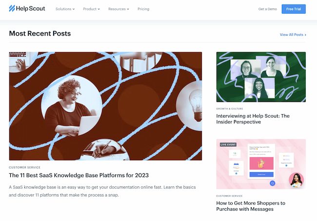
Sometimes, the best blog designs are also the simplest. Help Scout, makers of customer service software, uses a unique but minimalist design on its blog that we love — it limits copy and visuals and embraces negative space.
What we particularly like about this blog is its use of featured images for all posts, including the “Most Recent Posts” section that highlights recent or particularly popular entries. These images catch the readers’ eye and signal what the post is about. And it works — everything about this blog’s design says clean and readable.
2. Microsoft Work & Life
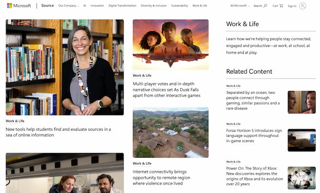
Full disclosure: We’ve totally gushed over Microsoft’s microsites before. We can’t help it — what better way to revitalize an old-school brand than with a blog that boasts beautiful, interactive, and inspiring branded content? Plus, the square images in the layout of these stories are reminiscent of the Microsoft logo. This helps it achieve valuable brand consistency.
Microsoft Work & Life is also a prime example of how a business blog can be a major asset for an overall rebrand. In recent years, Microsoft has worked to humanize its brand, largely in response to a rivalry with Apple.
The “Work & Life” microsite has a simple tagline — “Learn how we’re helping people stay connected, engaged and productive — at work, at school, at home and at play.” It’s the softer side of Microsoft, so to speak.
When you’re trying to convey a certain brand message, you can use your blog to communicate it — both aesthetically and content-wise.
3. Pando

An important aspect of a well-designed blog is a consistent color scheme and style. After all, 80% of consumers say that color boosts their recognition of a brand.
It’s interesting to see how color consistency can unify the more diversified elements of design. Pando, a blog that explores the startup cycle, incorporates a set palette of colors — orange, green, pale blue, lavender, and deep yellow — in several sections of its site. These colors appear in the background, highlight bars, and certain areas of text.
But it also uses several different fonts — all of which manage to look seamless when tied together by a cohesive color scheme.
4. Design Milk
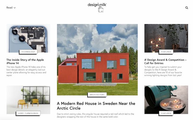
Design Milk, an online contemporary design outlet, uses a simple layout to highlight its posts. If the arrow beside “Read” at the top left points down, you can scroll through featured images and teaser text for a variety of articles. If the arrow beside “Read” points up, you see a perfect showcase of blog topics and highlighted posts.
That’s an internal link strategy, which helps to encourage readers to stay on the site longer.
The social icons at the top of each post are a pleasant addition to the overall look and feel of the site. They’re easy to spot and make it easy to share Design Milk’s content. (And to learn more about adding social buttons to your blog, check out this post.)
5. Fubiz
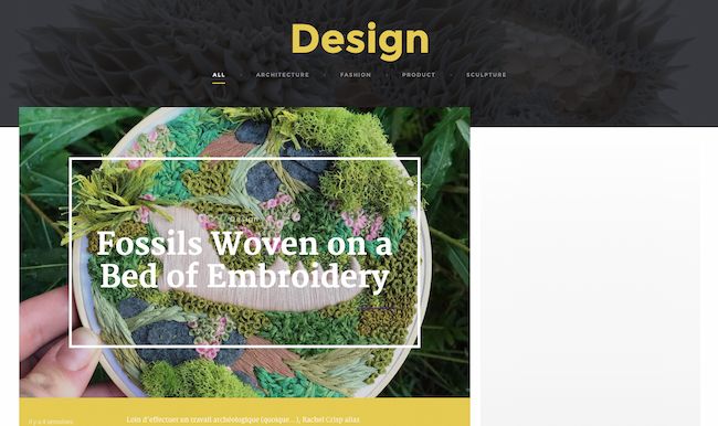
Fubiz, an art and design blog, is an example of a really sleek design that also includes some cool personalization.
The blog’s homepage makes it easy for readers to side-scroll through “The Highlights.” Below that is the Creativity Finder, where visitors can choose their persona — from “Art Lover” to “Freelance” — location, and the type of content they’re looking for. From there, readers can browse content specifically catered to them.
We can’t help but love the images, too. Each featured image has a distinct style. By using the design to highlight these powerful photographs, Fubiz is able to visually attract visitors to its content.
For a similar look, check out the CMS Hub theme collection on the Envato marketplace.
6. Webdesigner Depot
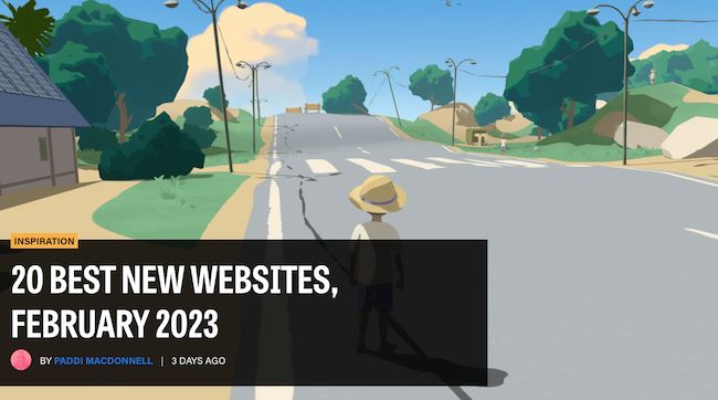
With a name like “Webdesigner Depot,” it’s no wonder that this design news site is visually appealing.
One thing that we particularly like is the responsive images on each individual post. The subtle motion of the image as readers scroll over a range of articles helps catch visitors’ eyes.
And check out the effective use of the featured image to highlight the most recent article. This approach pulls the viewer immediately into the blog’s most recent content.
What’s more, the color scheme, background, and fonts are all consistent — which keeps this blog looking professional, but still distinct from the basic blog templates you might be used to seeing.
7. Mashable
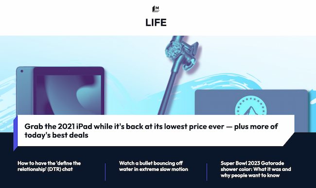
I mean, just look at that header image — bold colors, recognizable gadgets, and contrasting text. It absolutely catches the reader’s eye — no pun intended.
Mashable breaks its content into three noticeable sections on the homepage:
- New posts get attention with a large featured image and three highlighted blocks.
- Posts for each section get attention with a featured image at the top of two to three columns with a short list of headlines underneath.
- Then “Trending” posts show up to the right, with bold text on top of a shadow box graphic.
This multi-pronged approach to displaying content can help readers decide which kind of news matters to them the most. They can quickly choose between attention-grabbing top stories, the hottest posts, or stories on the topic they’re most interested in.
The “Related Stories” that end each post are also a great feature to connect readers to more of the content they’re looking for.
8. Brit + Co
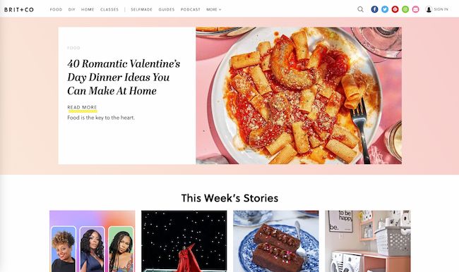
Everything about the Brit + Co homepage says clean, warm, and welcoming. It’s free of clutter, making the content more digestible, and the layout is extremely organized.
We dig the seasonality of the site, too — from avocado jack-o’-lanterns on the first of October to dinner recipes for Valentine’s Day. Adorable, and replete with colorful, fun photos to illustrate each story’s content.
The subtle “This Week’s Stories” header also serves as a nice way to promote popular content, without being too in-your-face about it. Plus, with such great visuals, we took note of the nod to Pinterest. That icon is important to include when your blog incorporates so much attractive imagery.
9. Tesco Food Love Stories
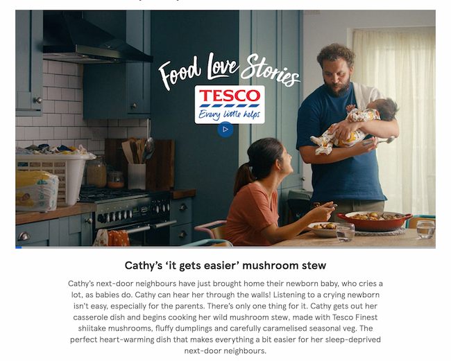
We love the colorful, consistent design of Tesco Food Love Stories, from British grocery chain Tesco.
Remember how we keep harping away at brand consistency? Check out the way this brand naturally incorporates the logo into its photography and featured video.
What Tesco has achieved is a great balance of simplicity and boldness. The layout is minimal, but not dull. Warm and welcoming shades underscore each content highlight and recipe, and the photos add dashes of colors throughout the site. It’s a great example of how the right imagery can achieve an appealing “less-is-more” appearance, especially if that fits in with your overall brand concept.
10. HubSpot
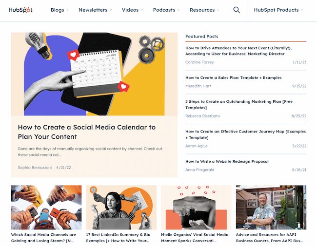
HubSpot’s blog finds a way to pack a lot of exciting content into the page while still being easy on the eyes. Notice that, above the fold, it features one blog post with a large image, title, and call-to-action to read more. The featured image is unique to the brand with an appealing combination of photography and graphics to draw the eye.
To the right, there’s a list of top posts to engage readers with the wide variety of content on the blog. This makes it easy for readers to connect with HubSpot or learn more.
Plus, there’s that consistency again. As you keep scrolling down the page, each section is visually consistent no matter what topic, podcast, video, or blog post you’re looking for. Using this strategy can help you build brand trust.
11. I Love Typography
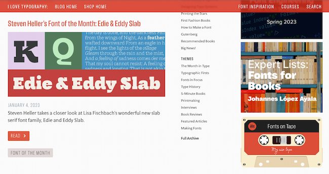
If you’re into design, you understand the power of fonts. The right font can make words sing on a web page, while the wrong choice can be a hard-to-read mess. So, a blog that features hundreds of fonts has to get creative with blog design.
I Love Typography gets the balance just right with a clean and simple design. Three vertical columns separate blog themes and top posts from the most recent additions to the blog. Meanwhile, it dedicates the right side column to highlighted blog features. This section features fun clickable graphics (like that sweet cassette tape) that balance the bright colors and shapes that dominate the posts on the left-hand side of the blog.
If you’re creating a blog for the first time, this is a smart approach to borrow from. You can also check out these tips on starting a successful blog.
12. 500px
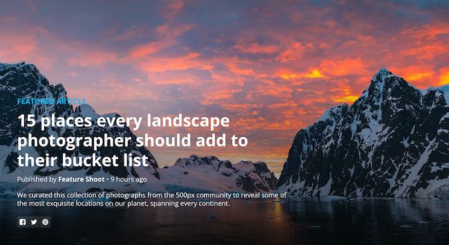
The photography blog, 500px, leads with one featured article and a big, bold, high-definition photo to draw the reader in. That makes it pretty clear what the blog is about — it boasts valuable content on photography with gripping photography.
Plus, how cool is it that the social links are right there, obviously displayed above the fold? They keep readers engaged with the content and make it easy to share the photography. Plus content with images gets more than double the engagement on Facebook as posts without images do.
13. Wired
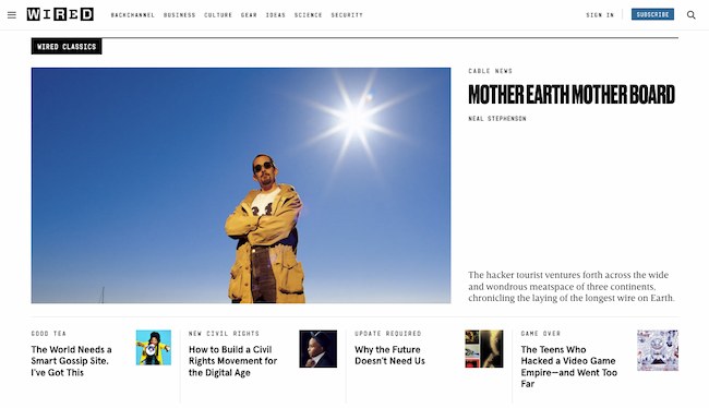
The more topics you have on your blog, the more chaotic the experience can be for your readers. That’s why we like the refreshing simplicity of Wired’s blog design.
Depending on the size of your screen there could be eight or more headlines above the fold alone, but this design is still easy to scan and dig in.
Every post includes a featured image to draw you in. Then, striking font choices make it quick to understand the category, author, and headline for each post at a glance.
If your blog started simple and you’re having a hard time making it work as it grows, this blog is great inspiration for a redesign. You can also use this workbook for redesigning your blog website.
14. Golde
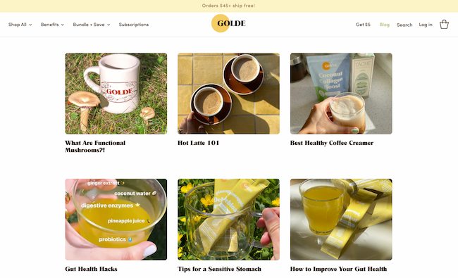
Golde is another blog that uses images for great communication. Using the brand name as a starting point for its blog “The Golden Hour,” Golde makes a featured image the focus of each blog post.
Then, the gorgeous photography uses yellow and green tones in each photograph. This creates a consistent, warm, and appealing feel to draw you into each blog post.
Once you click on a post, this blog makes perfect use of the space below the text to highlight products, recipes, and other useful resources.
15. Recode
Ads are a useful way for many blogs to generate income. Many small businesses offer a blog to highlight their products and services. At the same time, other standalone blogs can struggle to balance design with the need to monetize their content.
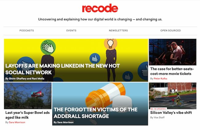
Recode features the latest tech news using an asymmetrical grid structure. Bold thumbnail images paired with headline text align with larger images with overlaid text in all caps.
This variety of approaches to image and text make it easy for viewers to scan and choose the post they want to read. The layout includes some animation too and this adds excitement to the blog layout.
Besides being a great user experience, this design lets the blog weave in ads that aren’t distracting to the eyes. At the same time, they also don’t blend in with the organic content, letting Recode create an authentic experience for its readers.
16. Pluralsight
This blog is a great reminder that blog designs don’t have to get super fancy.
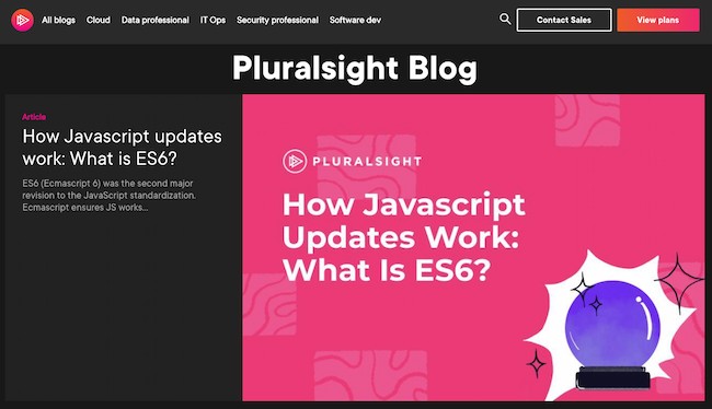
Notice the bold title at the top and center of the page. Then the featured illustration at the top uses a bright background and simple white-on-black text. That bold brand presence stays constant throughout the company’s blog.
The clean fonts, for example, match the logo and stay in line with the brand’s clear, informative voice. And the grid structure and headers for each section make it easy to understand what you can find on the blog.
We also like the easily-navigable archive links at the top and how easy it is to see the blog archive with minimal scrolling.
17. Crayon
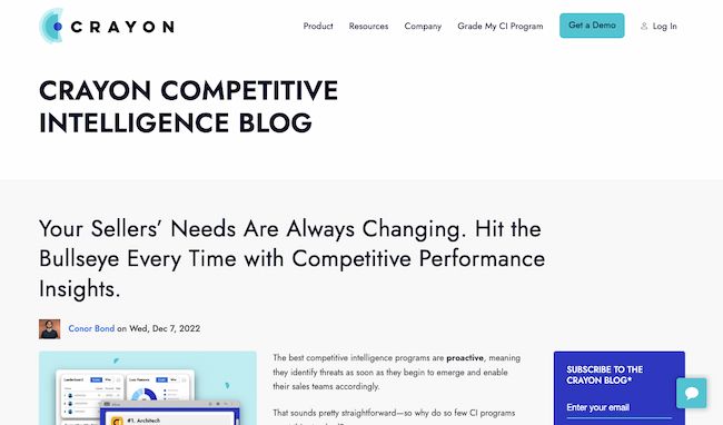
Many blogs want to show readers a little bit of everything they offer. But depth can be just as enticing to readers as breadth. If you want your visitors to dive into what your blog writers have to say, this blog design gives them an easy choice — just start reading.
With an extended teaser in the header, the focus above-the-fold for the Crayon blog is the latest blog post. As a reader scrolls down, they’ll find a grid with more content from the blog.
We also like the color coding by topic, which makes it easy to locate blogs of interest at a glance. You can see more text-forward blog design examples here.
18. Black Travelbox
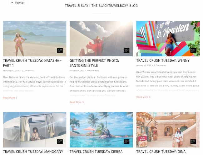
To clear up any confusion, Black Travelbox doesn’t make suitcases. It makes personal care products for travel. But the company has done a great job of connecting its portable balms, conditioners, and more with the joy of travel.
Plus, the folks at this company’s “Travel and Slay” blog know a thing or two about brand consistency across channels. The blog has a simple color scheme and matching fonts help to create a unified user experience from the shop to general content. At the same time, it throws in bold, colorful images to catch readers’ attention.
Visit the website and have a scroll — we think it’s pretty cool how the images vary, but each blog entry highlights a different “travel crush.” Then, it packs each post with bright photographs, smart interviews, and joyful stories.
19. Pixelgrade
![]()
Pixelgrade is a design studio that creates stunning WordPress themes for creative people and small businesses. Their blog page does a great job of highlighting one of their most recent or popular blog posts, alongside a clear call-to-action and a short excerpt.
What I like best is that the design of the page is 100% in line with their brand. If you like the design of their blog, chances are you’ll also want to try one of their smart and beautifully-designed WordPress themes.
For more WordPress blog design ideas, check out this post about WordPress themes for bloggers.
20. BarkPost
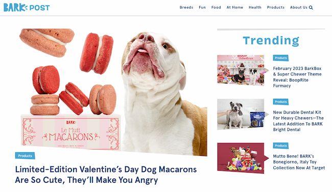
We kind of like dogs here at HubSpot. So when a blog dedicated to life as a dog owner came across our radar, it got our attention.
BarkPost, the blog of canine subscription box company BarkBox, is a great example of design for many reasons. First, look at the big fun font in every header — it’s quick and easy to read, even from a mobile device.
Adorable images make the posts for each topic noticeable, too — and, of course, all in the brand-matching, trustworthy blue.
We also like that BarkPost draws attention to its sister companies. Whether you’re interested in doggie dental care or the best food for your pup, this fun blog design makes it easy for dog parents and lovers alike to find the latest news and resources.
21. Goodwill Industries International
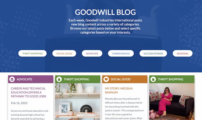
Who says nonprofit organizations can’t blog? Nay, they should. Check out this ultimate nonprofit marketing guide to make yours great.
In this example, Goodwill’s clean, colorful navigation (again — the trustworthy blue) draws the reader to the important elements of this blog.
The posts are also neatly positioned and easily accessible to readers. And, visitors can pick the type of information that matters to them the most by choosing a topic from the simple buttons in the graphic above the fold.
Finally, we love the emphasis on personal stories on the Goodwill blog. This design has long-form teasers that lead readers into this organization’s programs. This approach makes it easy to learn why so many people chose to support Goodwill.
22. Springly
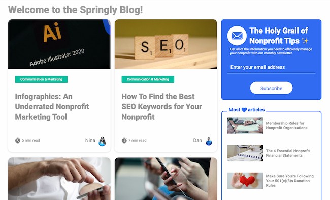
Keeping the nonprofit blogging train going is Springly, which makes excellent use of a simple grid format by highlighting the greatest resources of most nonprofits — dedicated people.
This blog has a simplistic design with concise text and a clear color palette for nonprofits looking for useful resources.
Each article card features the first name and picture of the author, shining the spotlight on its contributors. It also shows how long it will take to read the post.
Placing time and people at the forefront aligns with what most nonprofits focus on. This approach makes the blog more valuable to those who are most likely to contribute and use it.
Still looking for more inspiration and ideas? Click here to check out over 70 more examples of website blogs, homepages, and landing page designs.
Use These Blog Design Examples to Build Your Best Blog
Creating a beautiful blog isn’t just about looks. If you want your readers to really fall in love, the design of your blog should match the needs and expectations of your users. What’s most important to them? And what does your blog offer that no one else can?
Don’t just skim through these inspiring blog designs. Use them as a springboard to imagine how your blog can both connect with your audience and improve your blog design. Then, watch your readership grow.
Editor’s note: This post was originally published in 2013 and has been updated for comprehensiveness.

![Download Now: How to Start a Successful Blog [Free Guide]](https://no-cache.hubspot.com/cta/default/53/79c9c1d7-e329-46a2-9095-7ebf693a17f9.png)


![How to Optimize for Google’s Featured Snippets [Updated for 2024]](https://moz.com/images/blog/Blog-OG-images/How-to-Optimize-for-Googles-Featured-Snippets-OG-Image.png?w=1200&h=630&q=82&auto=format&fit=crop&dm=1724004002&s=13df73104762982790dab6dc8328023f)


